
In complex systems, traditional symbols must evolve to reflect the diversity of the human species. In this journey, I designed a diagram component as part of a CRM system, bridging the gap between tradition and modernity by creating symbols that represent and celebrate the entire spectrum of gender. Each step promises to provide insight, inspiration, and a deeper understanding of the power of design.
OVERVIEW
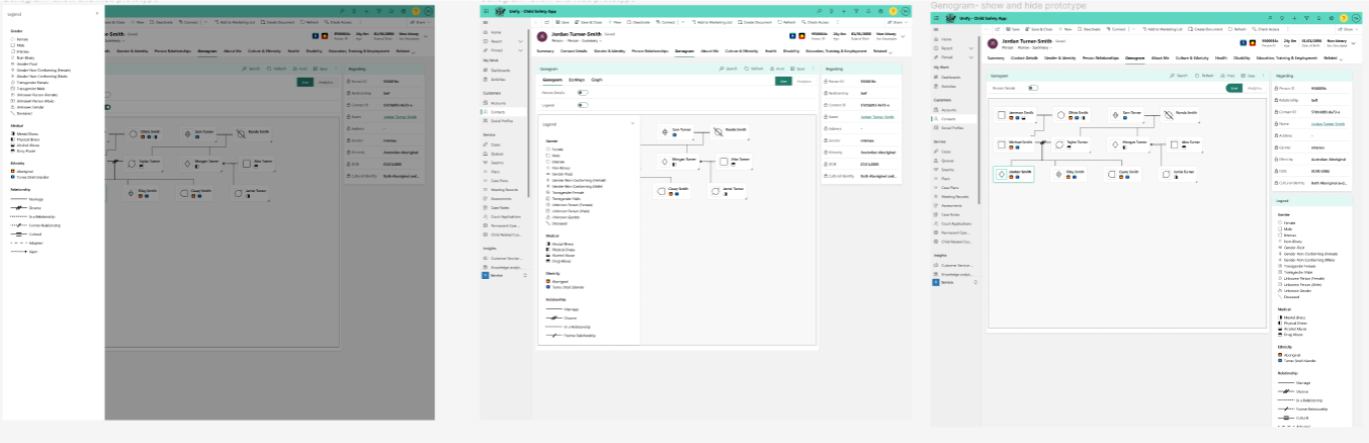
Genogram and its part in the department
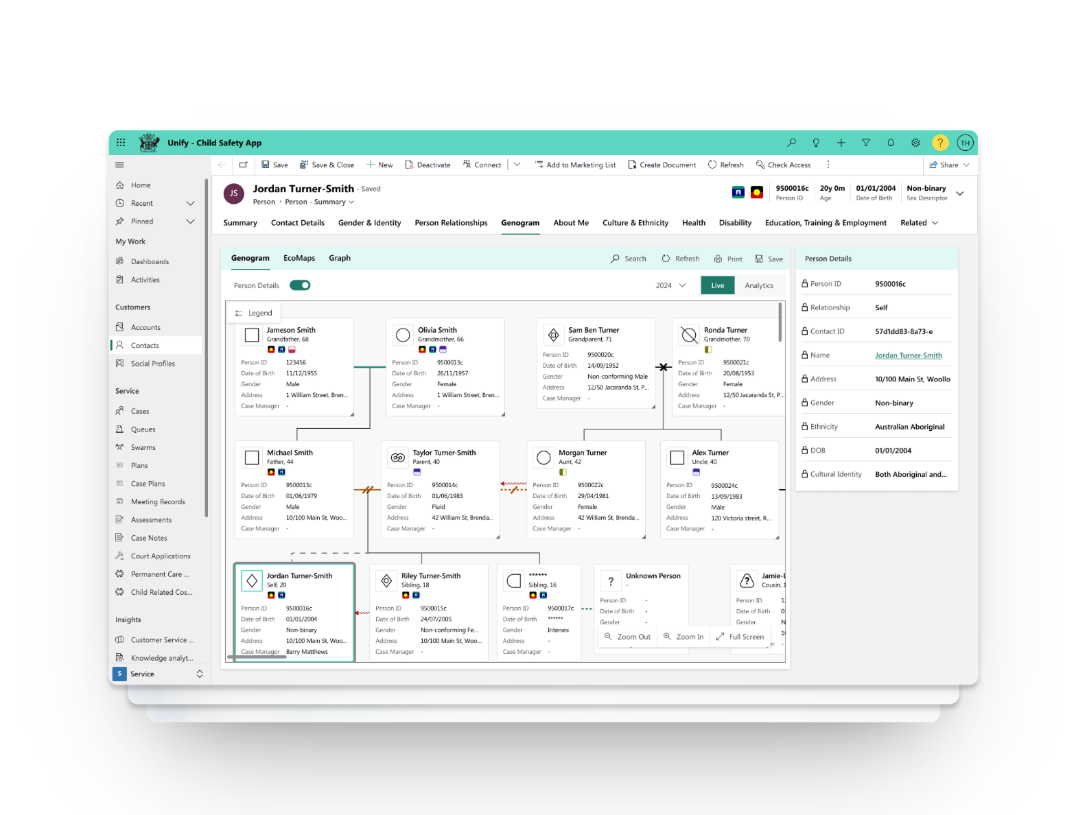
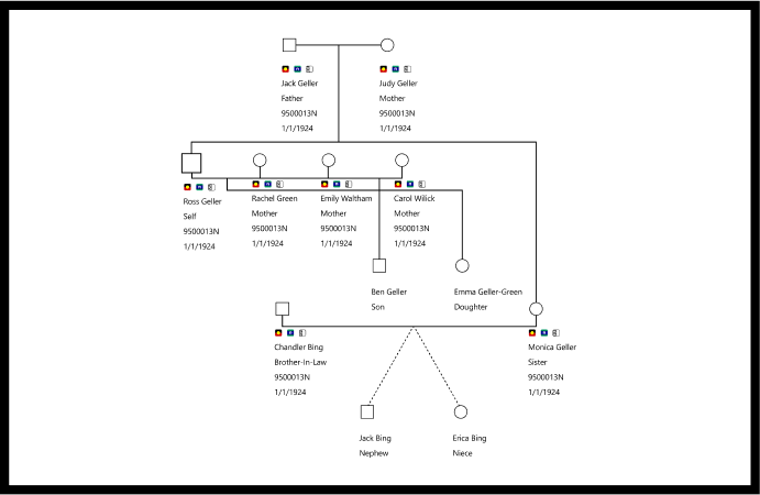
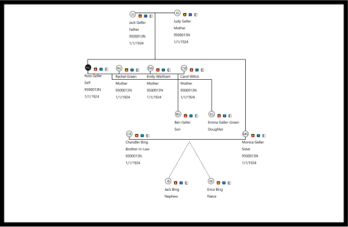
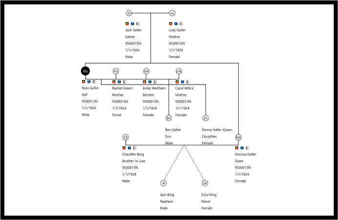
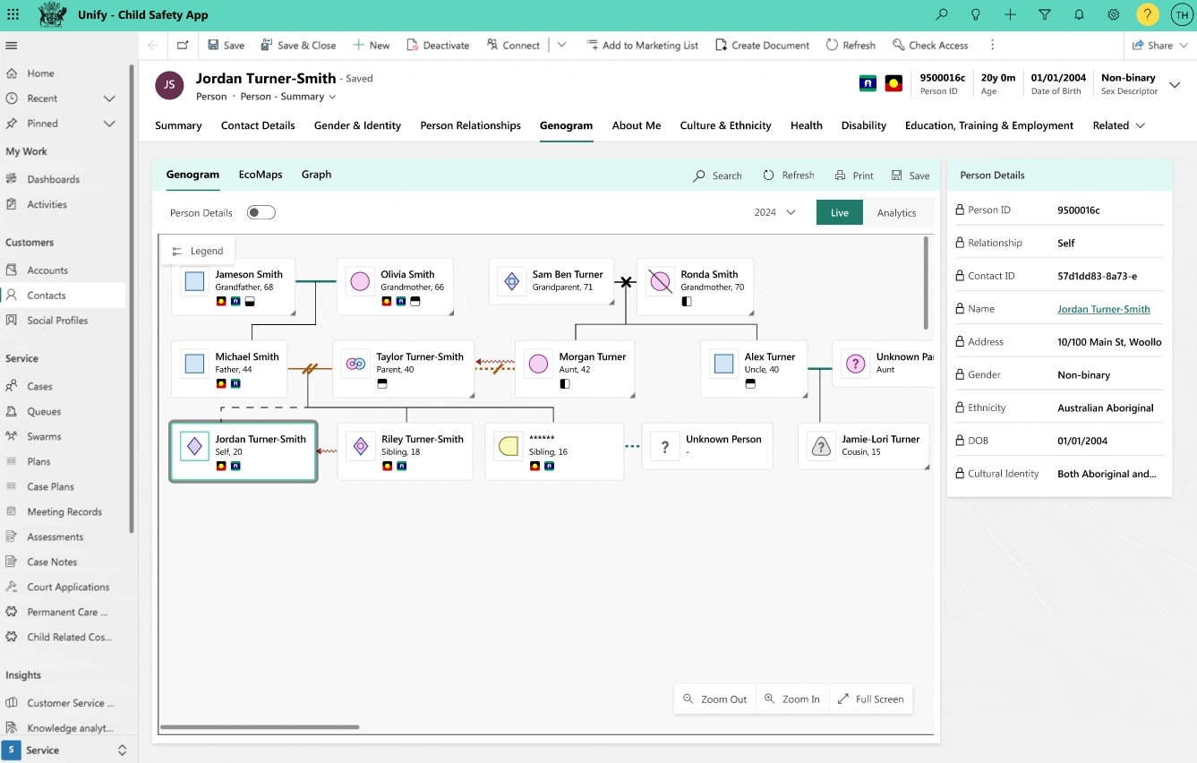
A genogram is a visual tool that helps clinical practitioners understand family relationships and networks. It can map out the complex relations present in a family and their biopsychosocial environment. This tool helps mental health professionals recognize symbols and codes in a snapshot observation.
GOAL
Increase awareness of the Genogram’s value
The genogram is a tool that is not used to its full potential due to a lack of knowledge and time. As part of the work with the department, we aimed to improve this by adding new critical symbols that were missing and creating a better interface appearance and experience that will be aligned with the rest of the CRM design guidelines. Ultimately, our goal was to increase awareness of the usefulness of genograms in psychiatric and social work practice.
The old UI: lack of readability, hard to understand the relationships. Lack of usability, if a user meets this screen for the first time, they would not understand the actions they could do and lack of consistency with the CRM design.
REQUIREMENTS
Facing the challenge
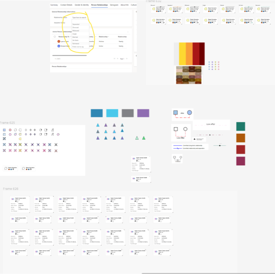
The priority was to design the symbols based on the client's requirements.
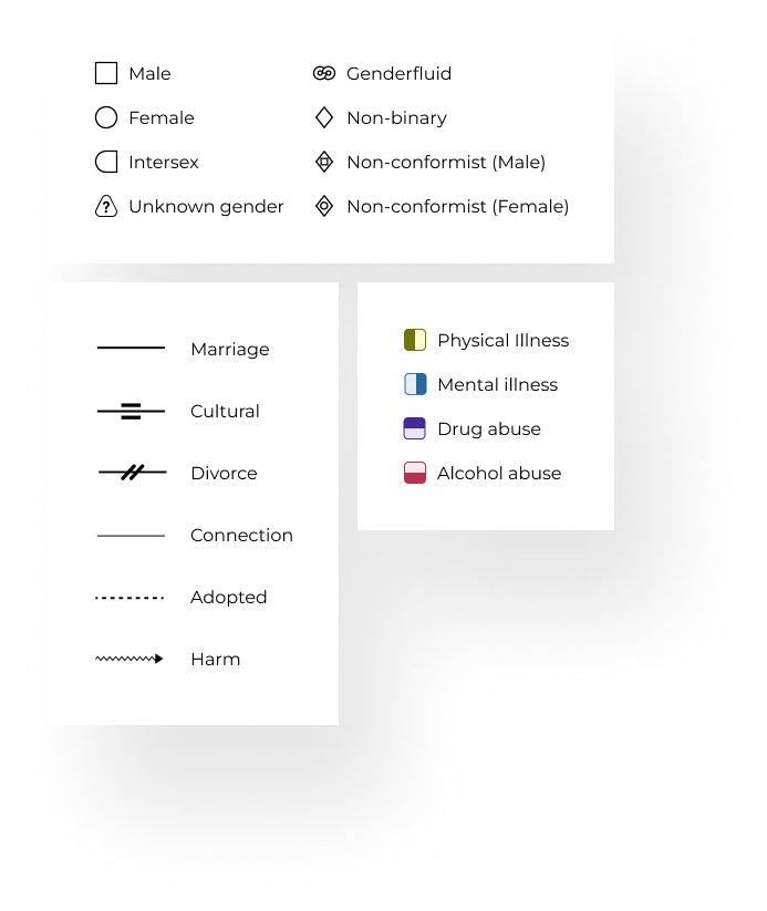
- 9 genders
- 4 Medical situations
- Additional symbols
- Relationships
My starting point and initial assumption were that if a Genogram is a known tool used in different fields it might already be a ready-to-use design system of icons color and design guidelines so my work should be easy.
I was wrong.
Although the Genogram follows very few basic rules and agreed symbols, part of the requirements didn`t have a representing symbol.
PROCESS
1. Exploring
Understand the basics very well so the new symbols and the whole component design will meet the standards and at the same time will solve the pain points with the genogram.
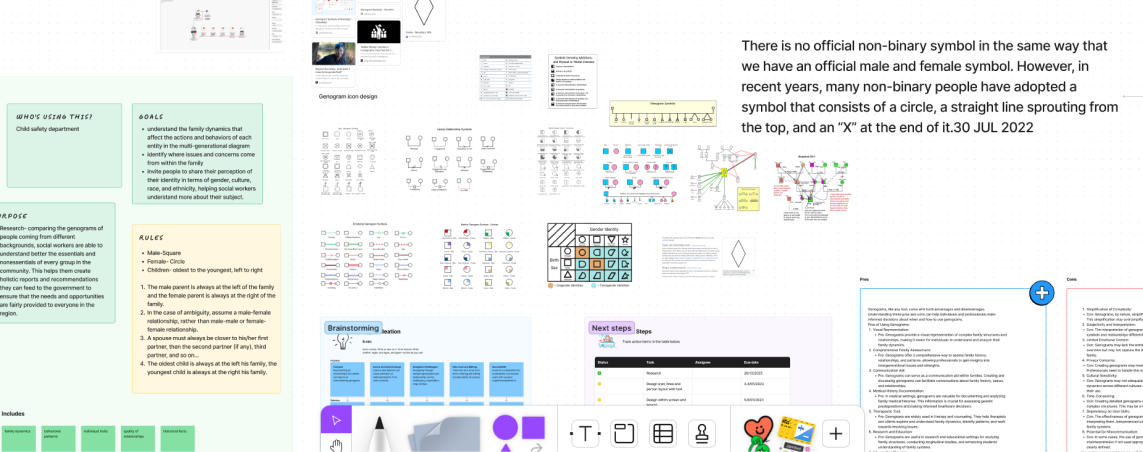
The canvas that gathered all the collected information, brainstorming with the team, insights from articles and more.
2. Drawing conclusions
Understand the basics very well so the new symbols and the whole component design will meet the standards and at the same time will solve the pain points with the genogram.

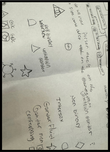
The symbol which has been adopted by non-binary people

Unknown gender as recommended by scientists
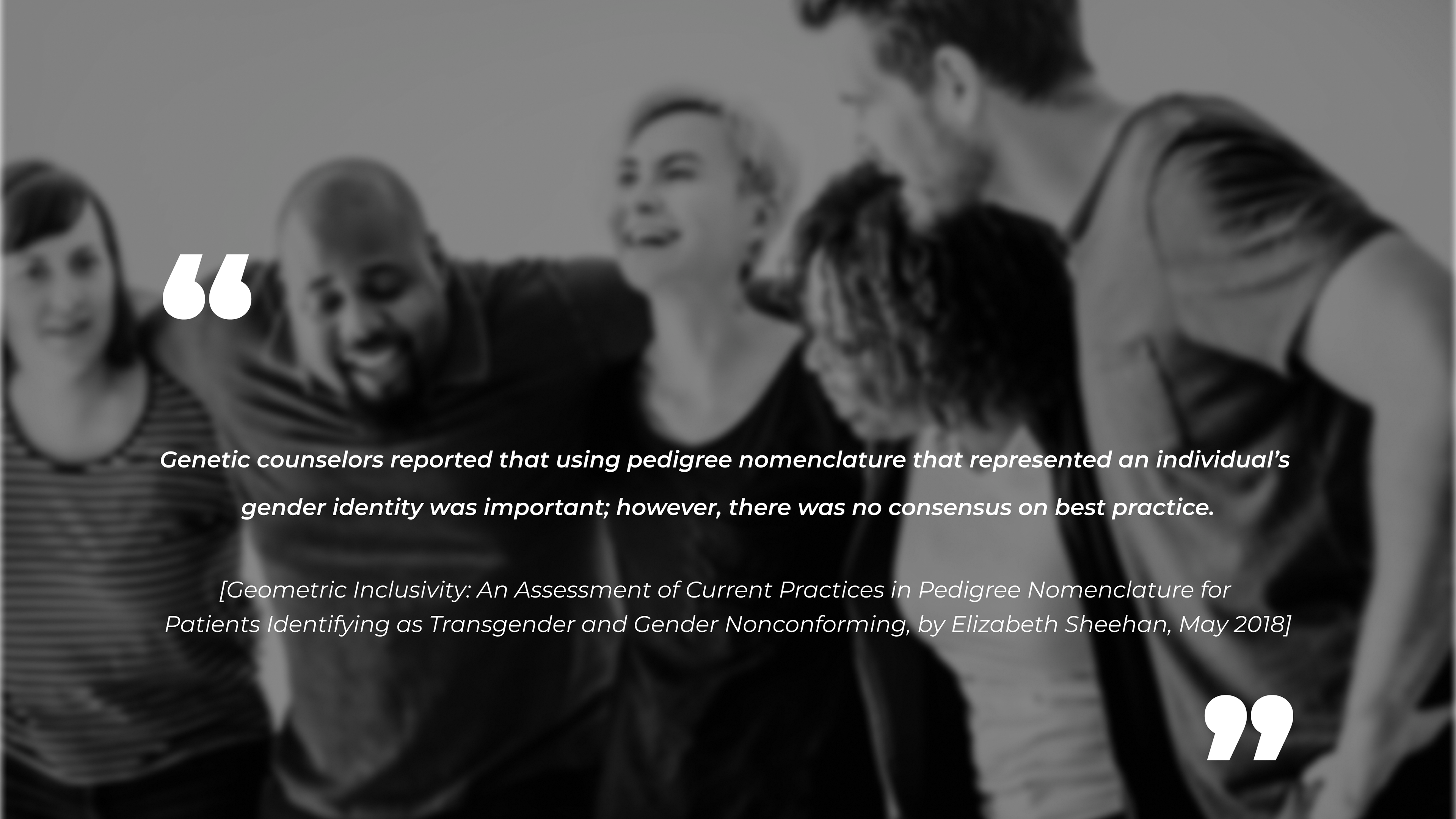
- There is Inconsistency of accepted pedigree symbols to represent the different gender and as a result it can be a potential barrier to uniform representation and consistent care for patients.
- When it comes to gender identity more education around it can increase confidence in addressing the young person psychosocial needs.
- When it comes to gender identity more education around it can increase confidence in addressing the young person psychosocial needs.
3. Experimenting
When designing the symbols I had 3 consideration
- The symbol/s that represented the gender outside of the genogram
- Studies on gender, genealogy and attitude of professionals if any
- The symbols that already exist and align with the department`s guidelines to create consistency
- The symbol/s that represented the gender outside of the genogram
- Studies on gender, genealogy and attitude of professionals if any
- The symbols that already exist and align with the department`s guidelines to create consistency

The process of designing the Gender-fluid symbol

The process of designing the Intersex symbol
Simultaneously with the design of the symbols, the understanding grew that the more symbols there are, the more likely the map will be less readable and more confusing.
Genogram wireframes in the traditional design with symbols and the alternative design with circle name initials
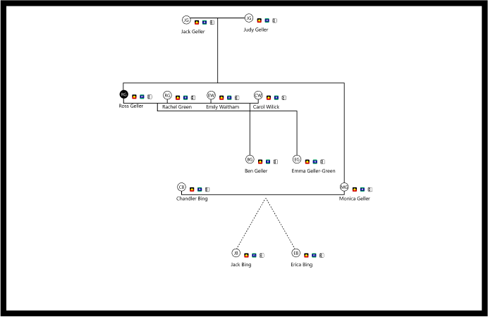
One solution that came out was that instead of representing gender is to create a circle with the name initials and the gender will be mentioned on the information list underneath.
But will adding more symbols truly enhance users' ability to grasp the map at a glance?
4. Designing
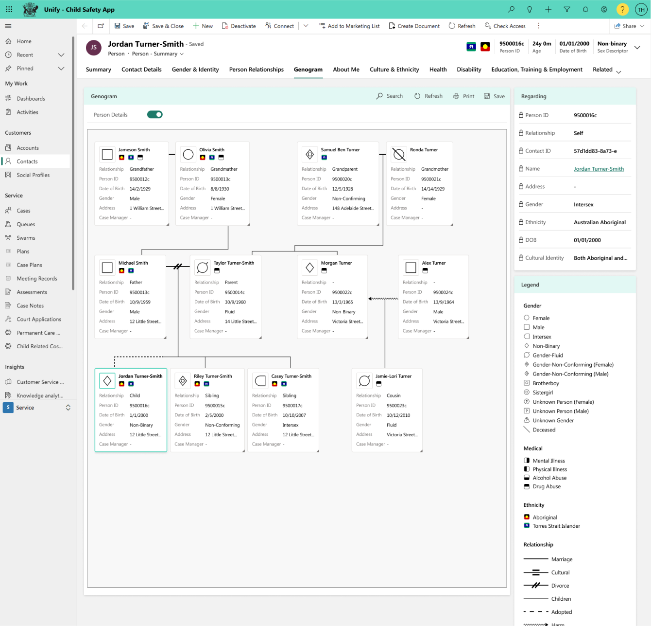
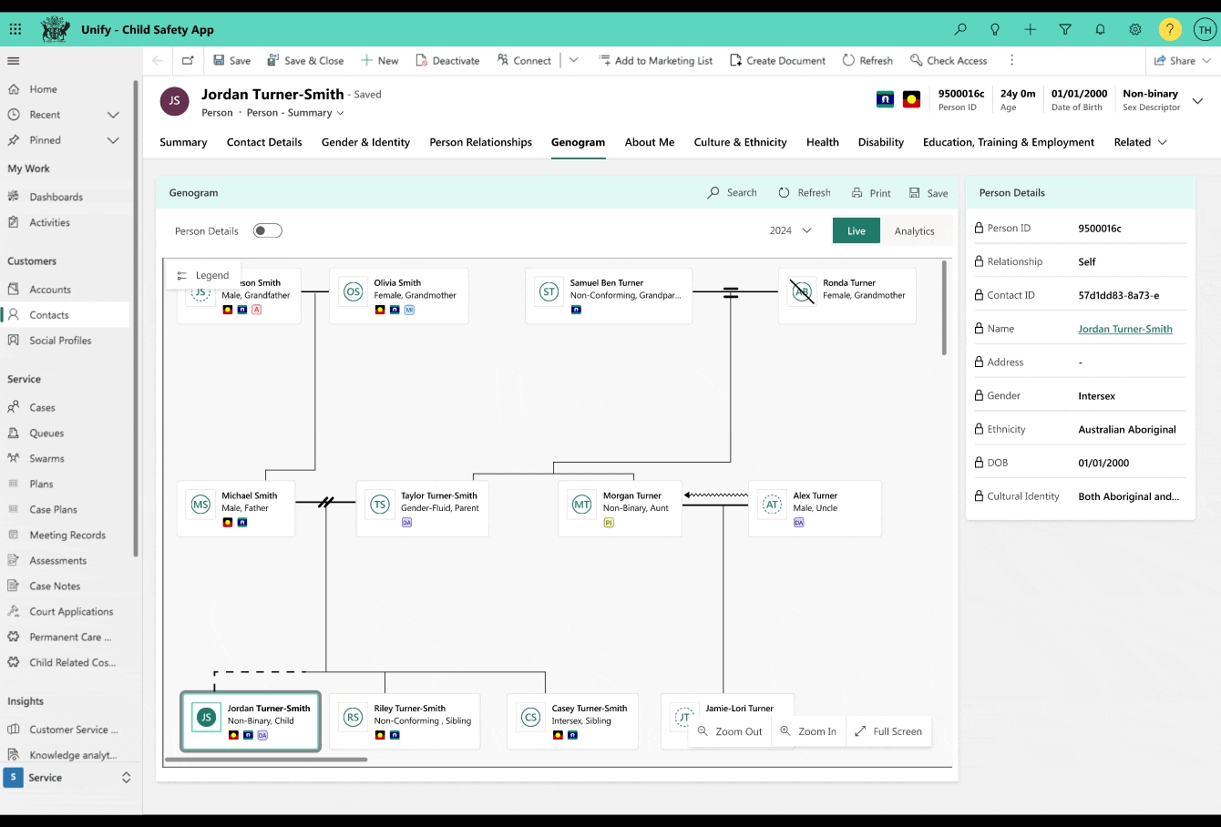
Heading to the showcase meeting with the client, we styled everything based on the Child Safety CRM guidelines and put everything together to provide a better sight on the map.
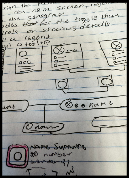
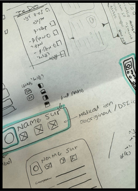
Sketches for UI design faze
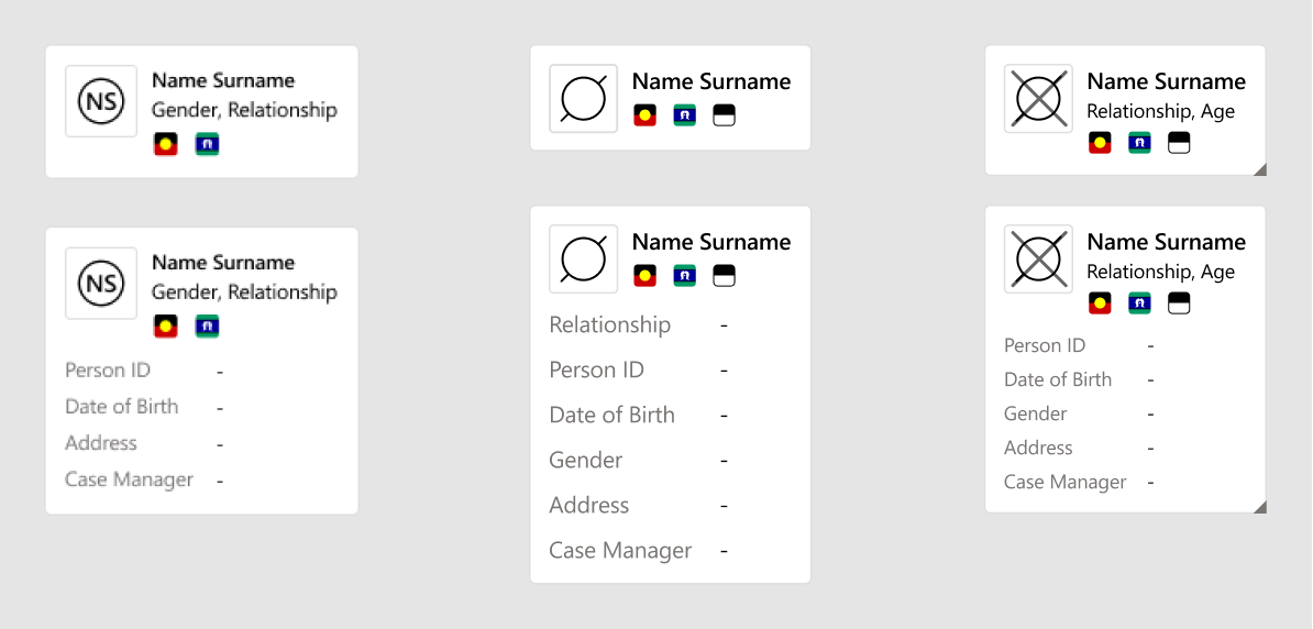
The design of the person card for the diagram

4. Iterating
After a few meeting sessions with the client and design adjustments we knew that since there is no consensus around different symbols on the Genogram, we should conduct user testing, to find out how the users from the department will understand the symbol and also suggest alternatives to choose between.
One of the iteration stage was about the place we will locate the legend that has crucial role in understanding the Genogram
From our experimentation page on Figma
5. Testing
We designed a few mock-ups to test the reaction of users in the department.
Black and white map with no colors
Map with the initials of a person and colored medical situations with the initials-
the goal was to test how crucial is to define gender by shapes and color and to simplify the map that is complex already.
Map with colored gender icons and abstract black and white medical symbols-
the goal was to test if the color is a beneficial indicator for the gender symbols in addition to the shapes
7. Testing results
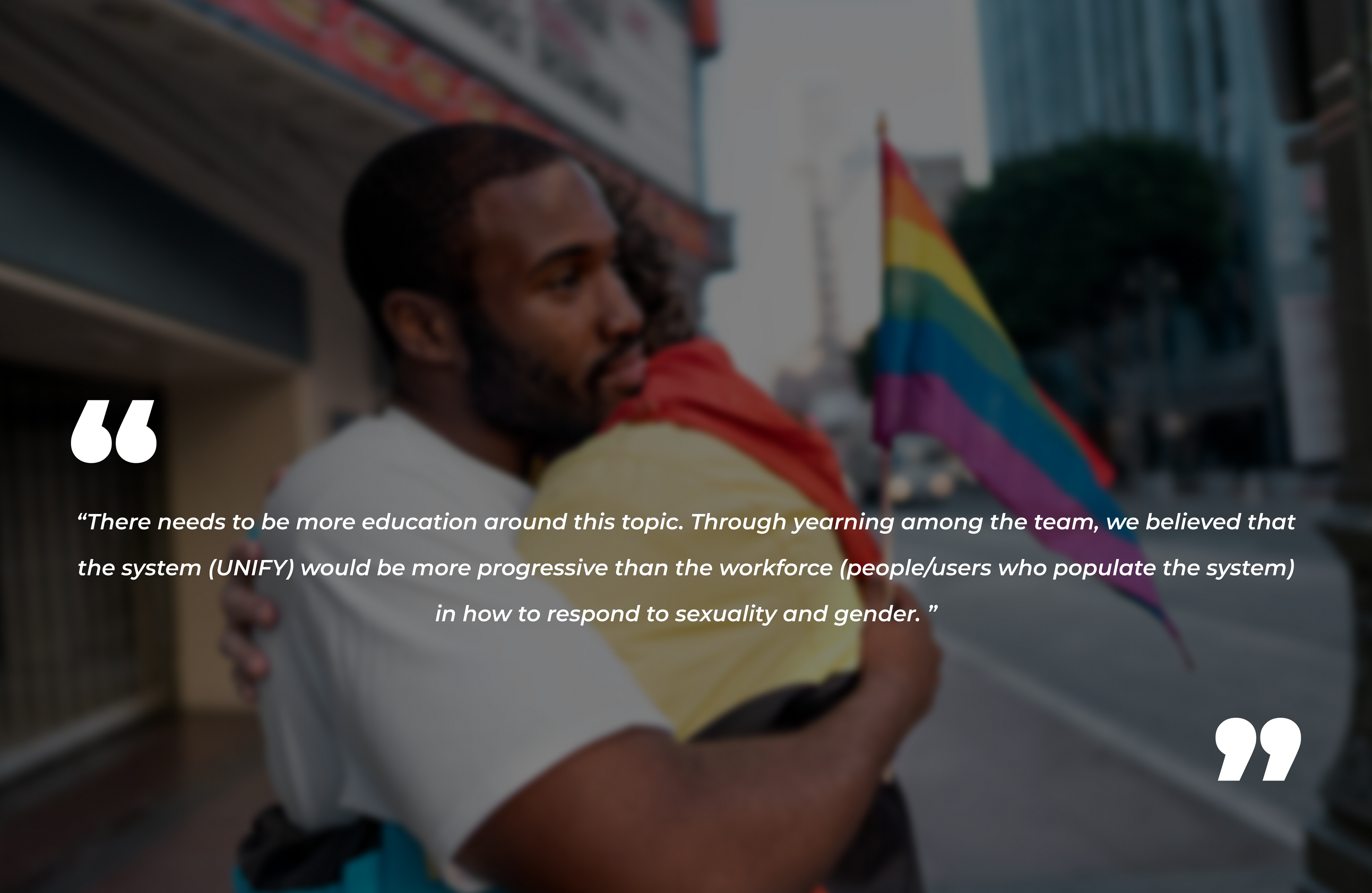
“When discussing these terms or identifying people in the UNIFY system there requires SIGNIFICANT sensitivity.”
- Some symbols lacked consistency with existing Genogram documents, leading to suggestions for alternative symbols in certain cases.
- Traditional colors like pink and blue, faced objections from users
- Users did not comment on the genderless icon
- Confusion arose regarding the choice of colors for medical and gender symbols, leading to a lack of understanding among users
- Clarification was needed for decisions based on research and Genogram guidelines, particularly regarding symbols like Gender Non-Conforming and Brother Boy/Sister Girl.
- Traditional gender stereotypes (e.g., boy as strong and square, girl as soft and circular) were questioned.
- Concerns were raised about the use of colors in medical situations alongside genders, such as purple for both non-binary representation and drug addiction.
- Users questioned the use of green to depict marriage and the negative connotations associated with divorce
OUTCOME
Getting decisions based on the testing results
The testing was crucial and had a significant impact. Eventually, we opted to keep gender symbols black and white and medical symbols colored, combining the two.
During symbol design, our goal was clear representation of gender while ensuring legibility. However, we found the symbol's inherent complexity and context challenging. Adding color might hinder rather than aid understanding.
Unlike medical symbols, colors are easily associated due to consensus on their meanings.
TAKEAWAYS
A small part of a large project
The design of the genogram is indeed a small part of a large project, but it was a fascinating process that involved in-depth research on gender, identities, perception and the context of color and symbols, and distilling everything into a complex component within a vast system that serves the department's employees to better understand the child's environment and family patterns to help him grow and support him.
