
Buying clothes online can be intimidating, especially for first-time shoppers. In order to give customers the closest feeling to a physical purchasing experience, I created a user-friendly, intuitive website influenced by 90s concepts.
Tools and Platforms: Photoshop, Illustrator, Figma and Shopify
Role
Founder, UI/ UX and Marketing content Designer.
Team
Co-founder, Fashion designer and digital marketing specialist- Paz Ben Baruch
Introduction
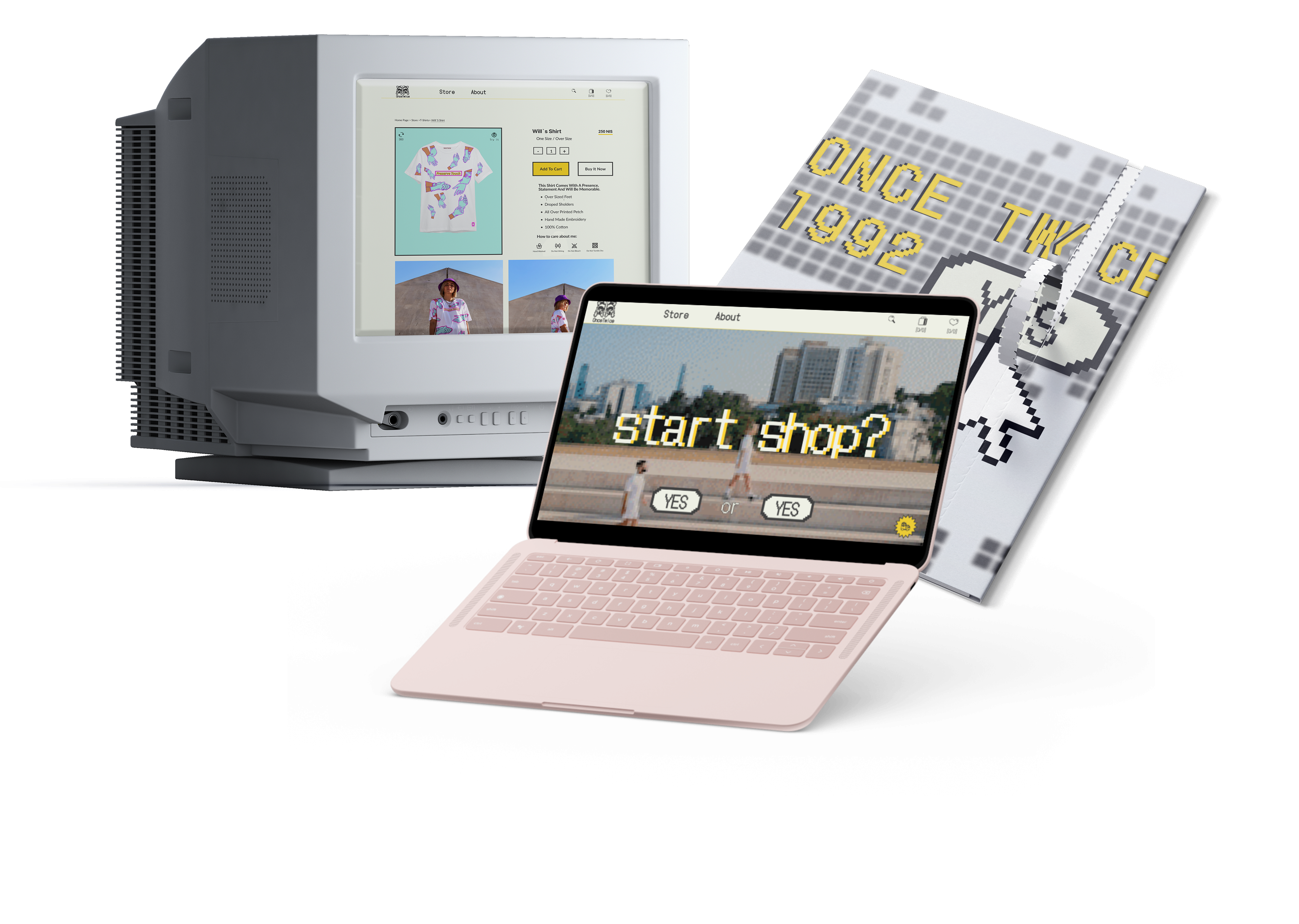
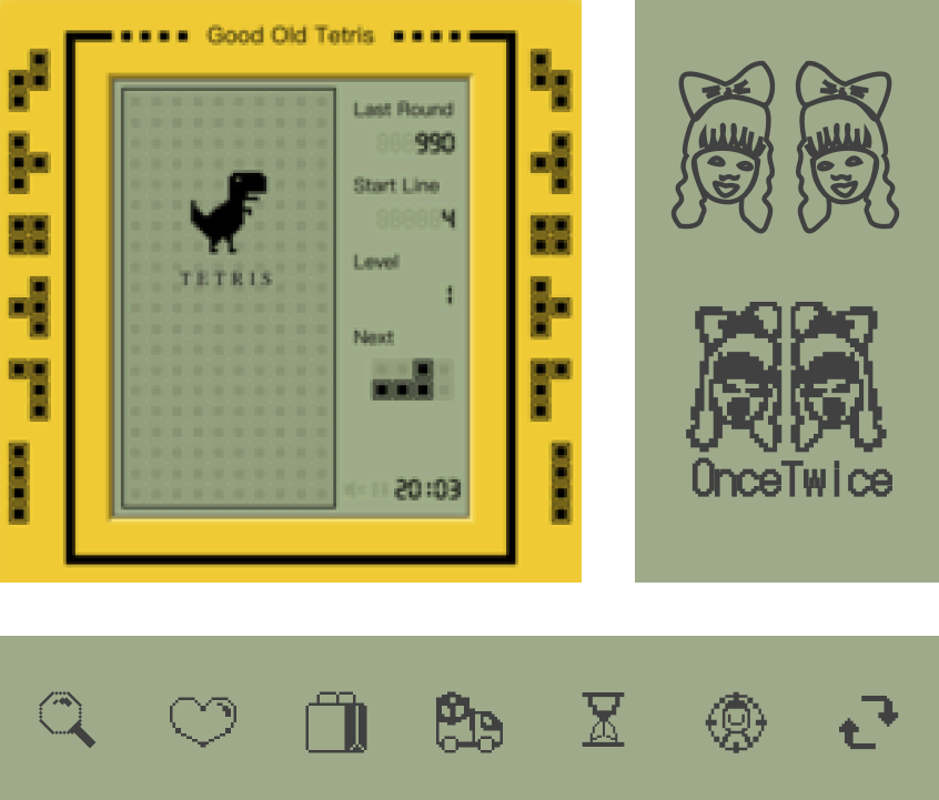
Conceptual online store designed as a Tetris game for a fashion brand inspired by the 90s and early 2000s. The goal is to showcase original designs that highlight the brand's uniqueness, reach diverse customers globally, and increase revenue.
Problem
The first website designed for the brand had too many options on the website navigation menu and too many pages, making customers confused and indecisive. We quickly realized that the design was making the user experience overly complicated, and it was time to make a change.
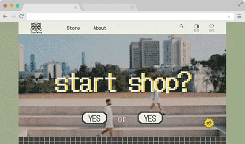
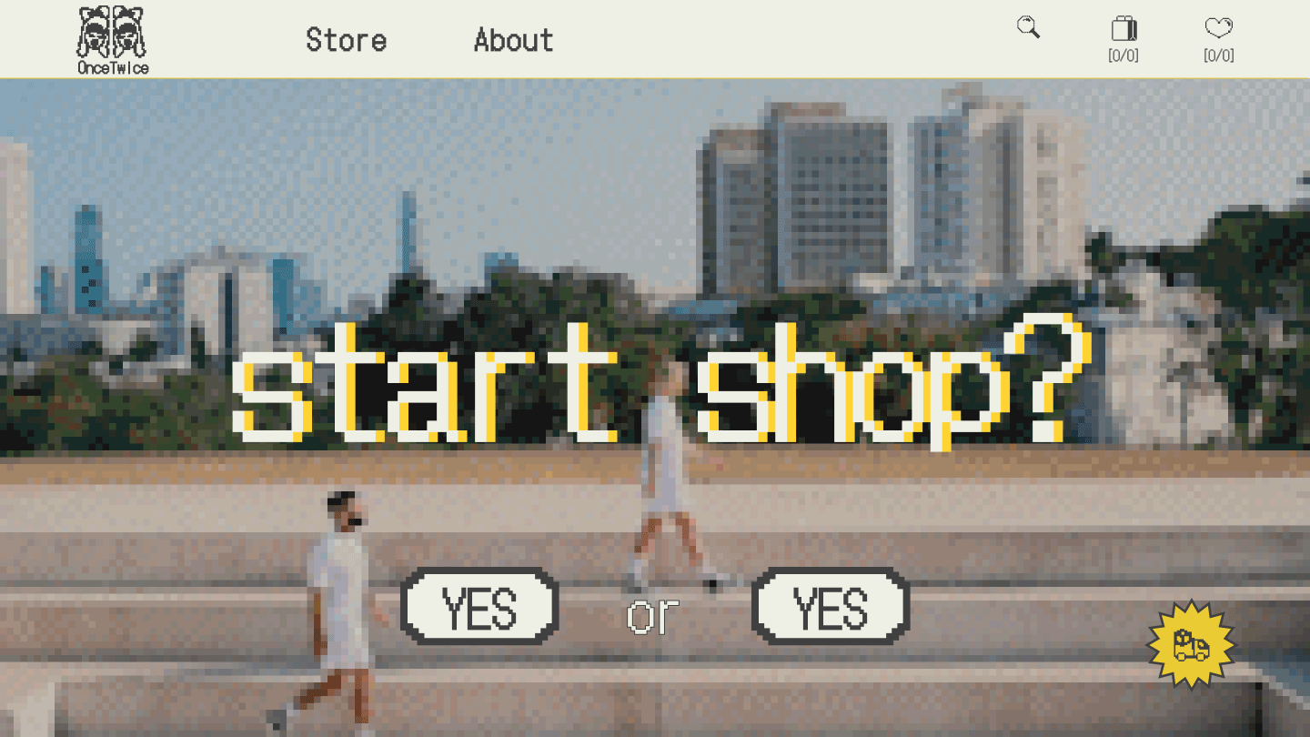
RE-DESIGN
Minimal Navigation Menu
The home page is designed to capture the user with clear navigation and engaging video collections that embody the brand's vibes. It encourages users to scroll down to explore the collections. The page is also designed to showcase the product in a way that is both visually appealing and informative.
We reduced the filtering options to allow easy navigation throughout the collection. We used a product filter bar that focuses on the variety of items available for purchase. This simplifies the shopping process and helps customers find the items they need quickly.

Clear with the customer
Transparency towards customers was one of our top priorities. Thus, we place the delivery issue at the forefront - the date when the customer's order will arrive.
Accessible information, which is usually hidden, in the fine print or at the end of a purchase.
Accessible information, which is usually hidden, in the fine print or at the end of a purchase.

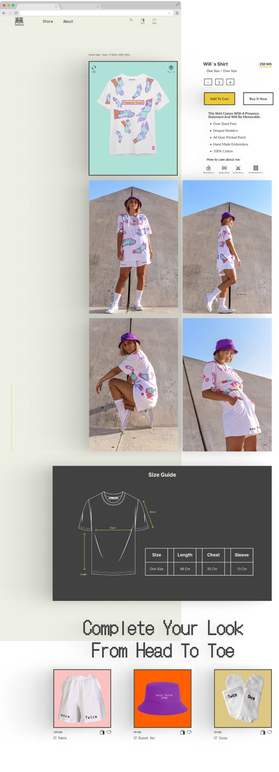
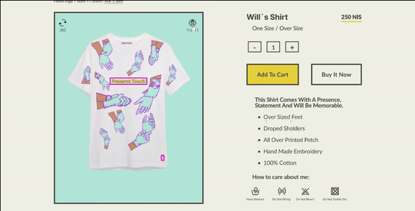
Focused product page
Based on the research and conversations that we did with our clients we realized that buying clothes online especially when it is from an unfamiliar brand can be challenging due to measurement inability. That is why our focus was on showcasing the product from all angles and dimensions. Additionally, we offered suggestions for complementary products to help improve the shopping experience.
°360 Product
According to our study, it is most difficult for users to match brands' specific cuts and body shapes. Users cannot evaluate a product from an unfamiliar brand prior to purchase.
We addressed this problem on 3 levels:
We addressed this problem on 3 levels:

1. 3D photograph that presents the product in a °360 view
2. Upload a personal image from the user's device
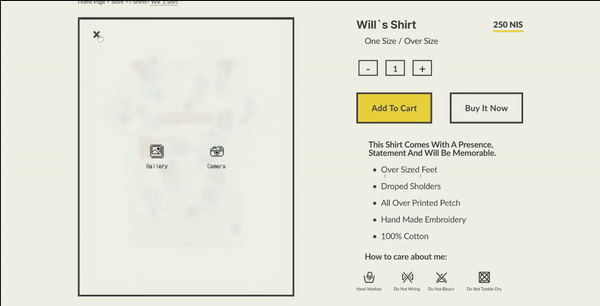
3. Self-photography in AR technology
The aim of those options was to create a complete customer experience Ultimately, the goal is to convert visitors into customers.
The inspiration for our brand and website design came from the pop art culture of the 90s. During this period, computers became popular.
As we hope to convey the brand's identity in our collections, we chose Tetris, pixel art and computer games to create a brutalist and unique design. We believed this design was ideal for our audience, as it was both modern and nostalgic. We wanted to show our customers that our brand values creativity and originality, and this design was the right way to do so.
Prototype
Final Thoughts
An e-commerce website requires some flexibility in design depending on factors like the collection itself and the seasonal inspirations of the brand.
For a new and inexperienced brand, the main challenges are:
- produce a design that Stands out from the competition
- speaks the brand language.
- manages to increase revenue by creating a good experience for customers.
- produce a design that Stands out from the competition
- speaks the brand language.
- manages to increase revenue by creating a good experience for customers.