As part of Airwayz, I redesigned a flight request platform used by drone operators to plan and submit flight operations in controlled airspace. My role was to lead the UX and UI design — from user research to interface design — ensuring the system could scale to future planning capabilities.
GOAL
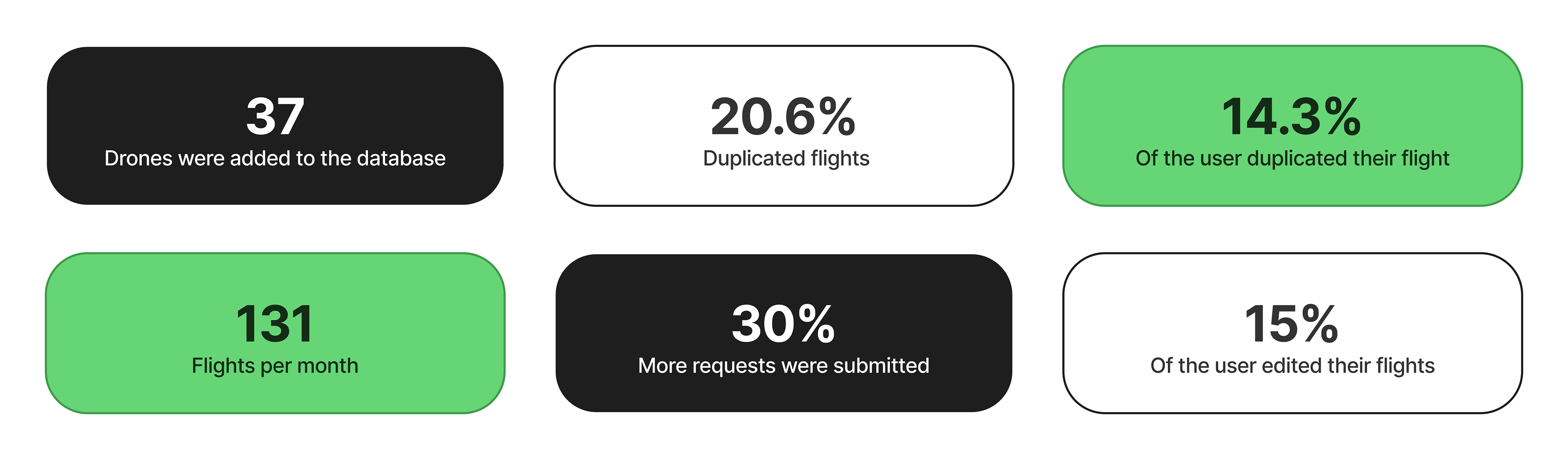
Optimization
Redesign the existing web app, optimize the flight request process, and prepare the product for entry into the B2C market.
Role
Product Designer
Design Team
Amit Nider
Product Team
Or Adar
Noa Evyatar
Development Team
Avner Russler
Ofir Azani
Timeline
October 24- April 25
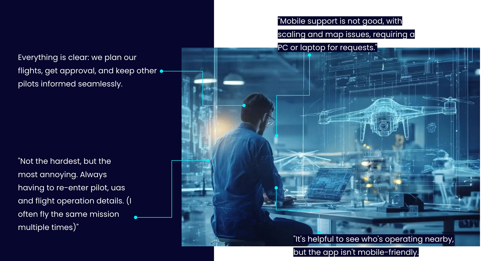
User quotes highlighted in the research summary presentation
PROBLEM
Delays and Confusion
Operators found it difficult to understand which zones required authorization and how to submit a flight requests. The existing flow created delays and confusion, which limited efficiency and regulatory compliance.
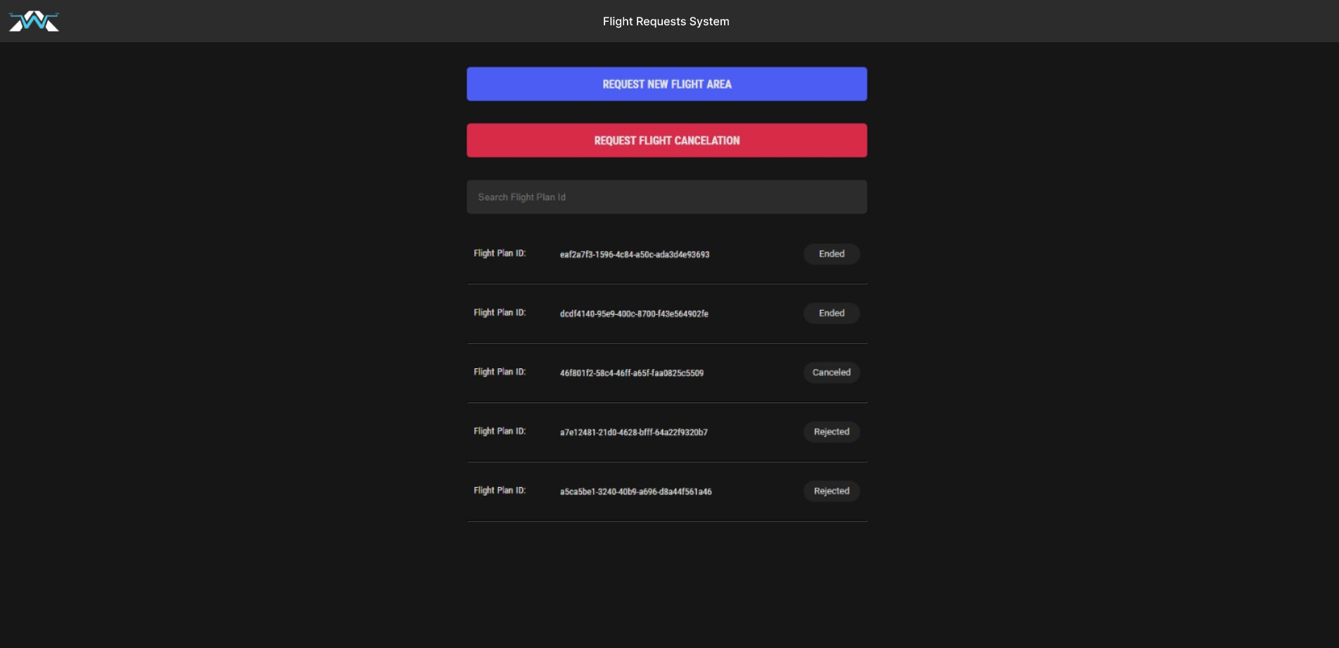
Flight list
User information
Flight details
Old design: Disconnected screens, missing flight summary, and the map appearing too late caused confusion for users
ANALYSIS
Mapping Opportunities
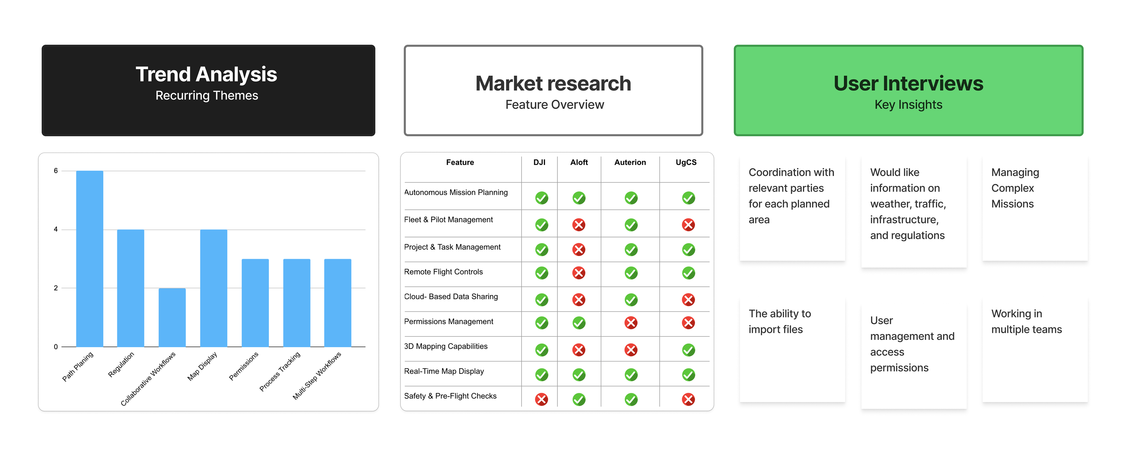
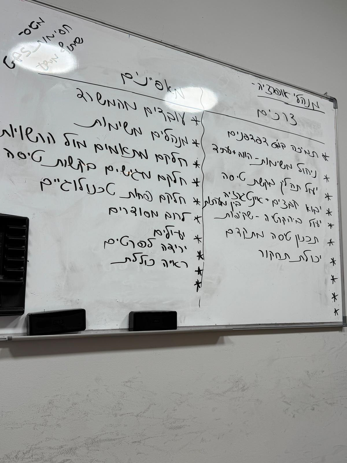
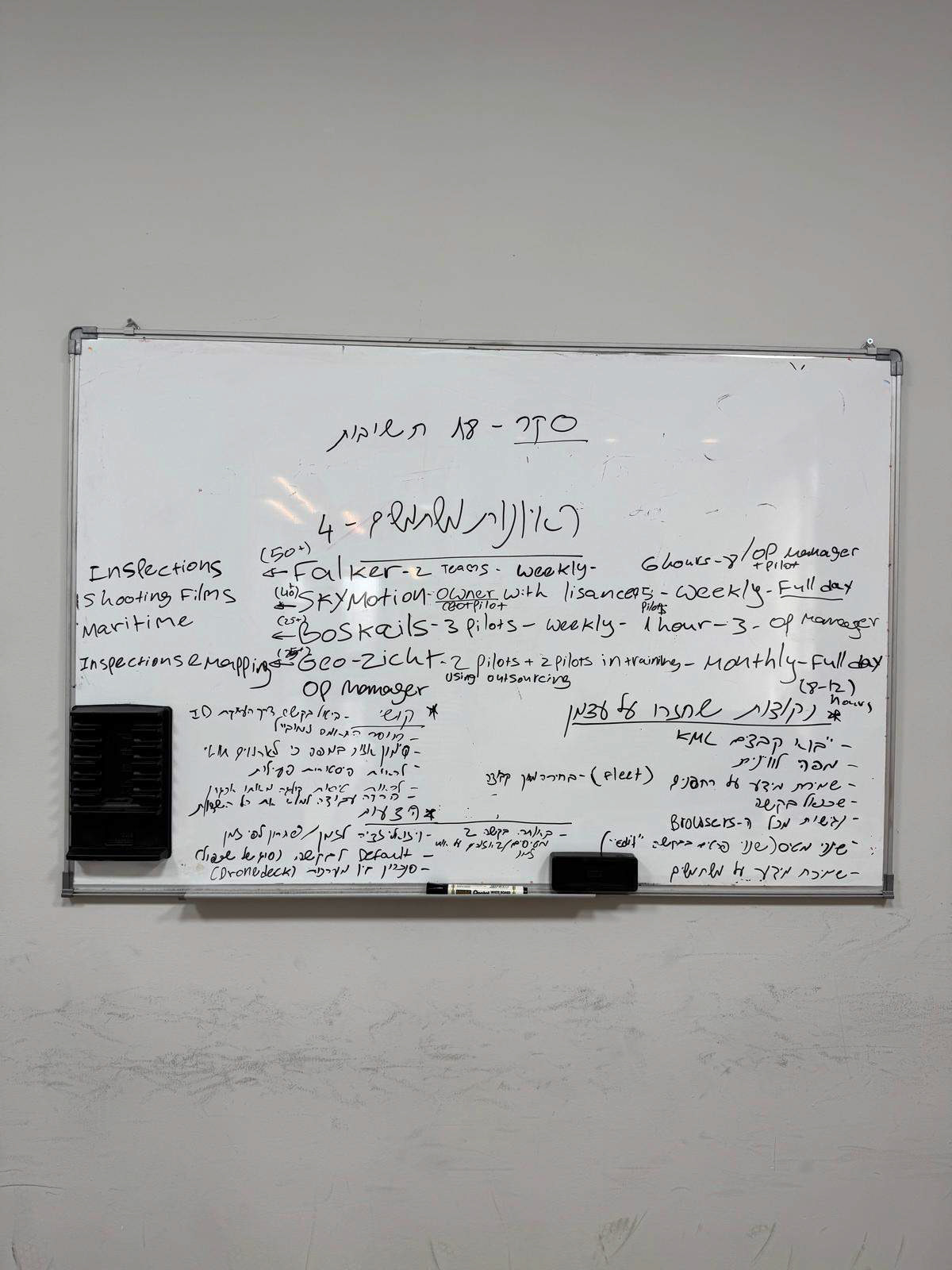
I led the initial research and distilled insights from articles, user interviews, competitors, and client feedback. These insights revealed key pain points: mission planning challenges, coordination frustrations, and opportunities for cloud-based features and improved risk management, which defined focus areas for the next design phase.
FOCUS
Gaps to Roadmap
The research revealed gaps, questions, and opportunities that required focus. I initiated discussions with the CPO and product and design teams to prioritize features and build a clear roadmap, ensuring we stayed aligned and focused on what mattered most.
Recommendations on features and directions to consider in the research summary presentation
What We Asked
1. Which real-time capabilities should be integrated into the product?
2. Who is the primary end user, and how should their needs shape the core flow and main features?
3. Do we need to support mobile, or is a desktop-only experience sufficient?
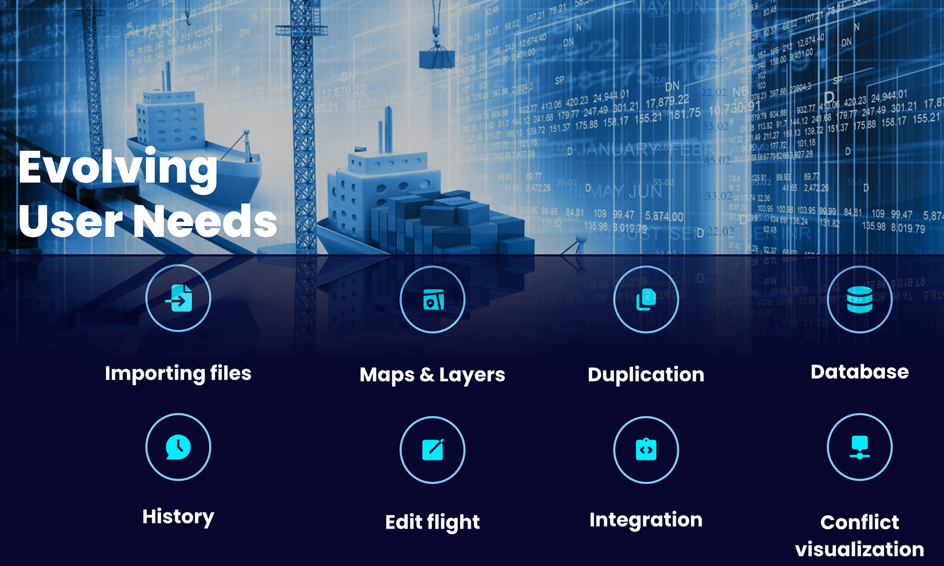
4. What additional information should we request from users, and how might it affect the flow?
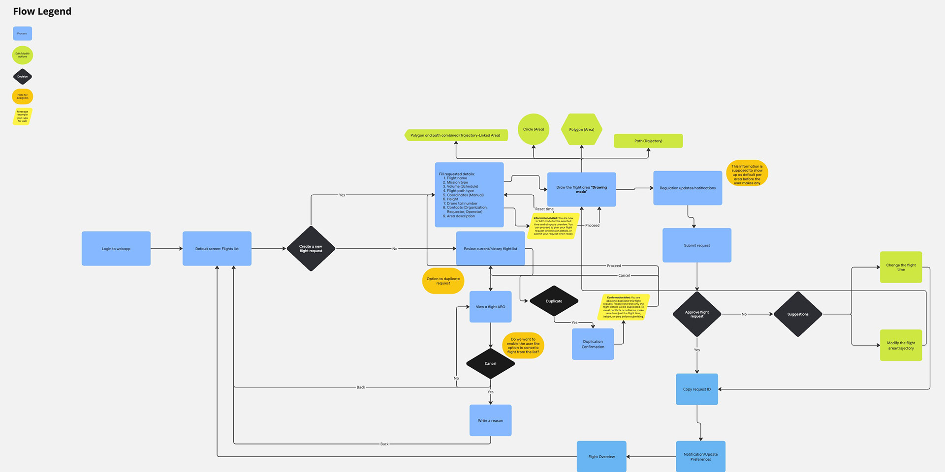
Mapping the full flow (left) — and highlighting the part we decided to dive deeper into (right)
________
We started with a lean version of the new design, with a few added features, including new map views. From there, I planned to continue interviews and define the next feature set together with the team.
________PHASE 1
The 'Facelift'
Our first goal was to refresh the interface — a “facelift” before new development began.
Using our design system as a base allowed us to maintain consistency across products and reduce future design debt.
Using our design system as a base allowed us to maintain consistency across products and reduce future design debt.
What I did
- Applied the updated design system
- Refined layout and hierarchy
- Simplified interactions
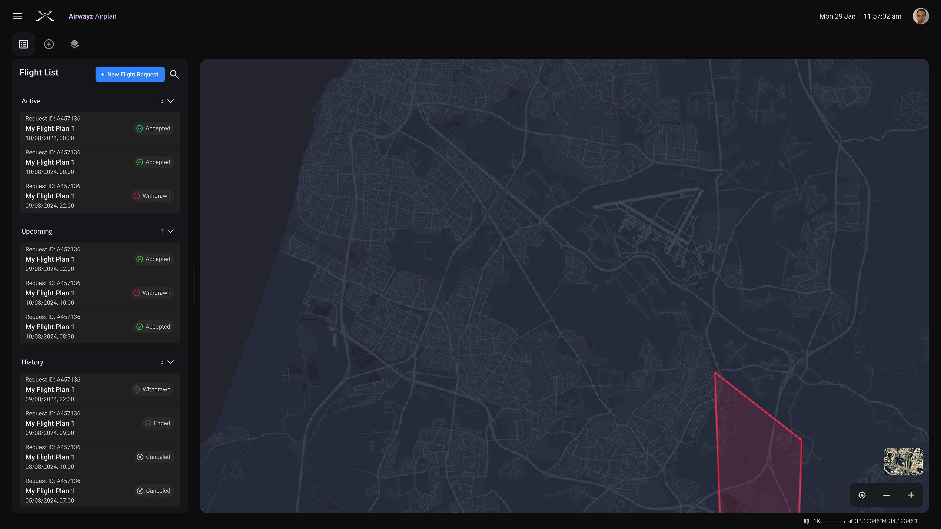
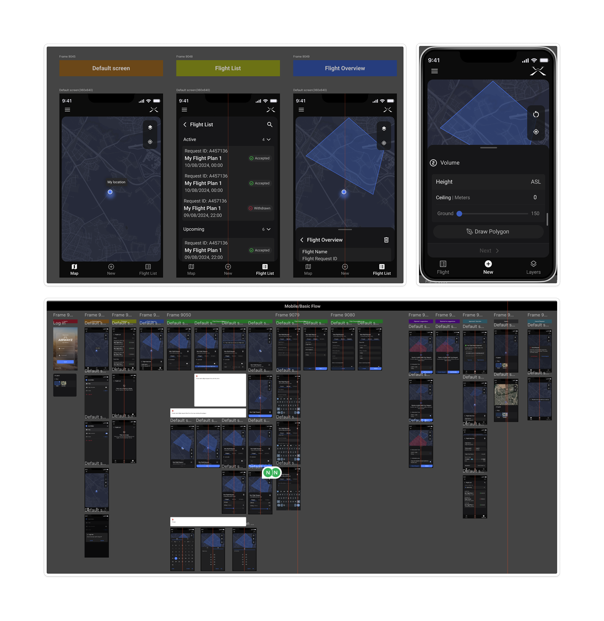
Flight List
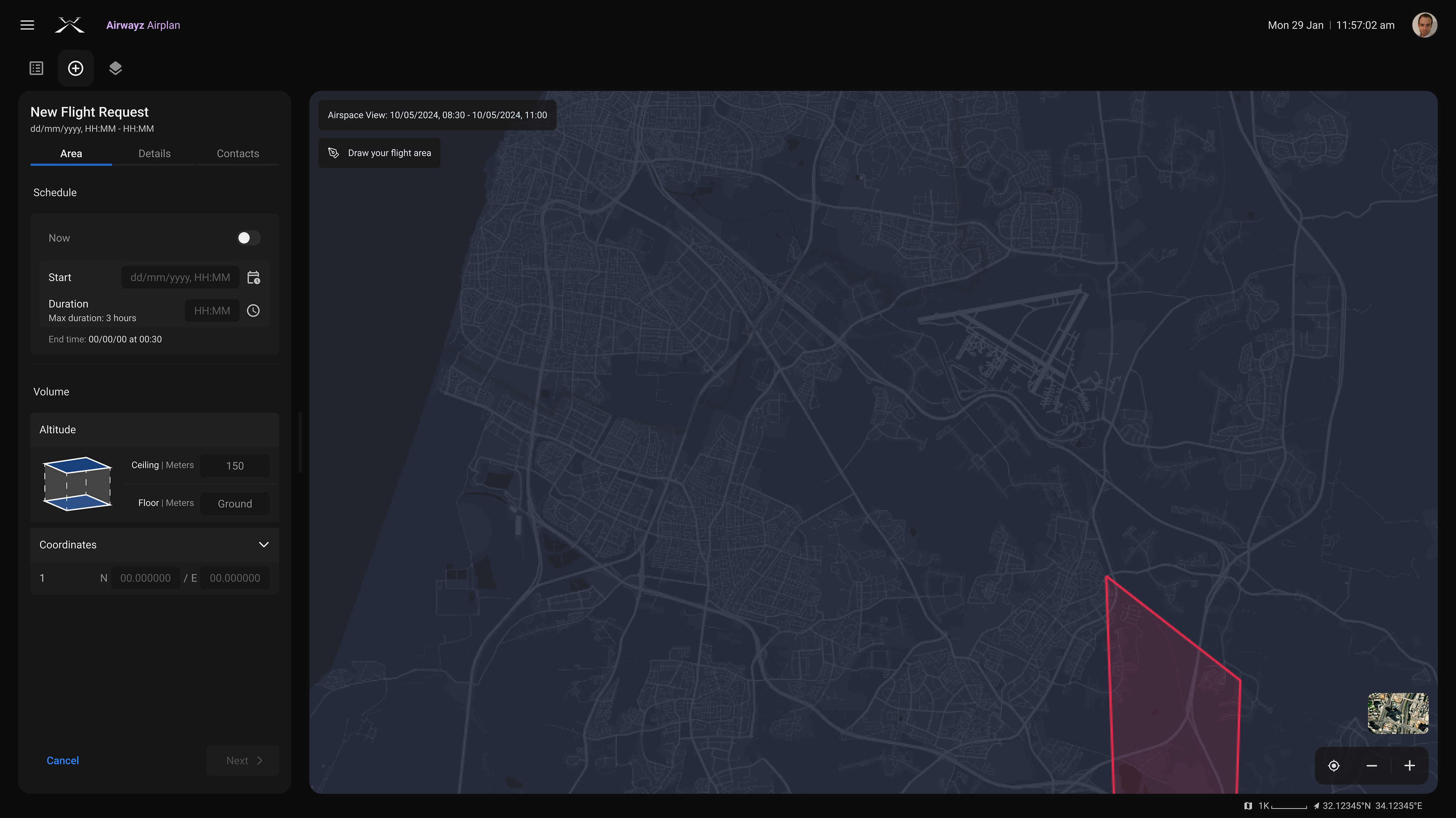
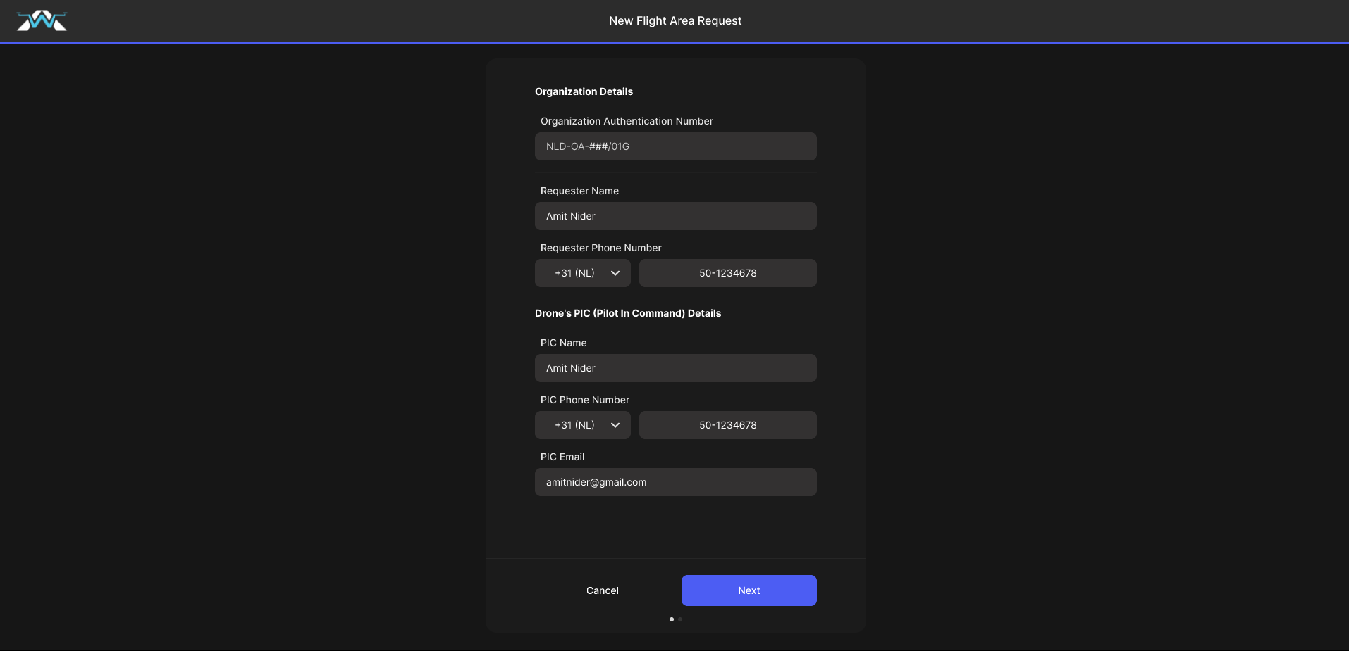
Flight Request step 1
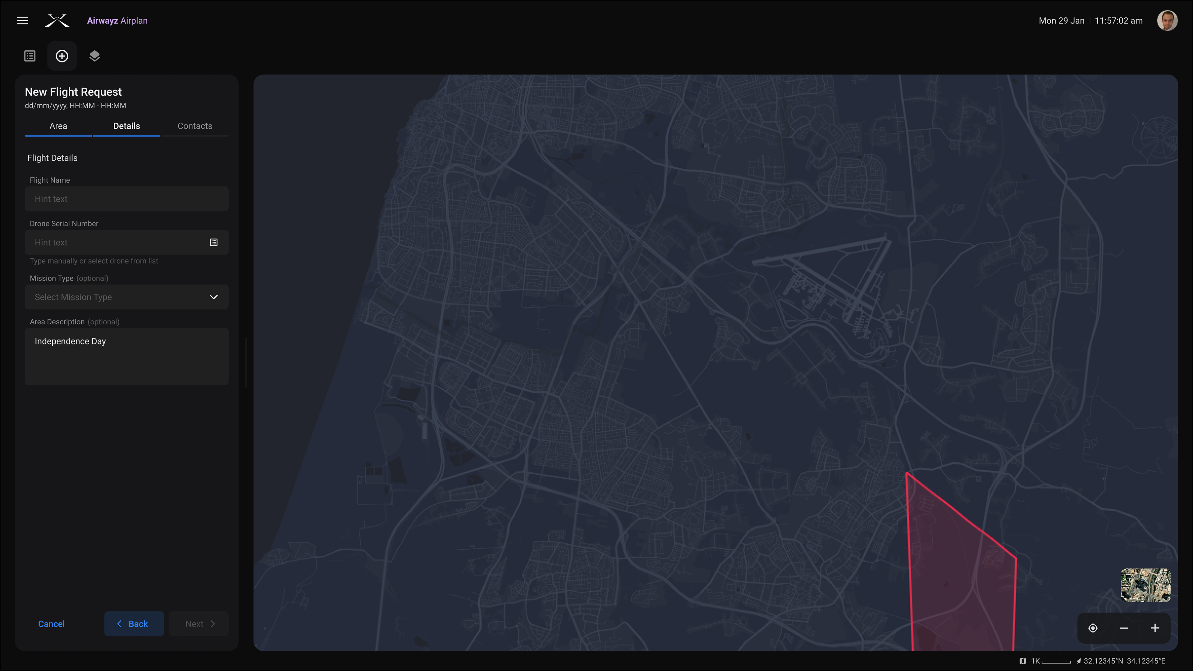
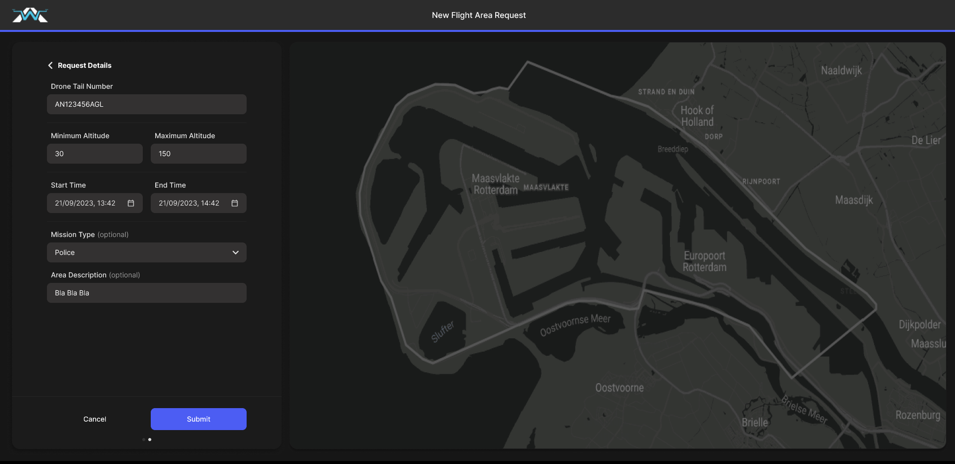
Flight Request step 2
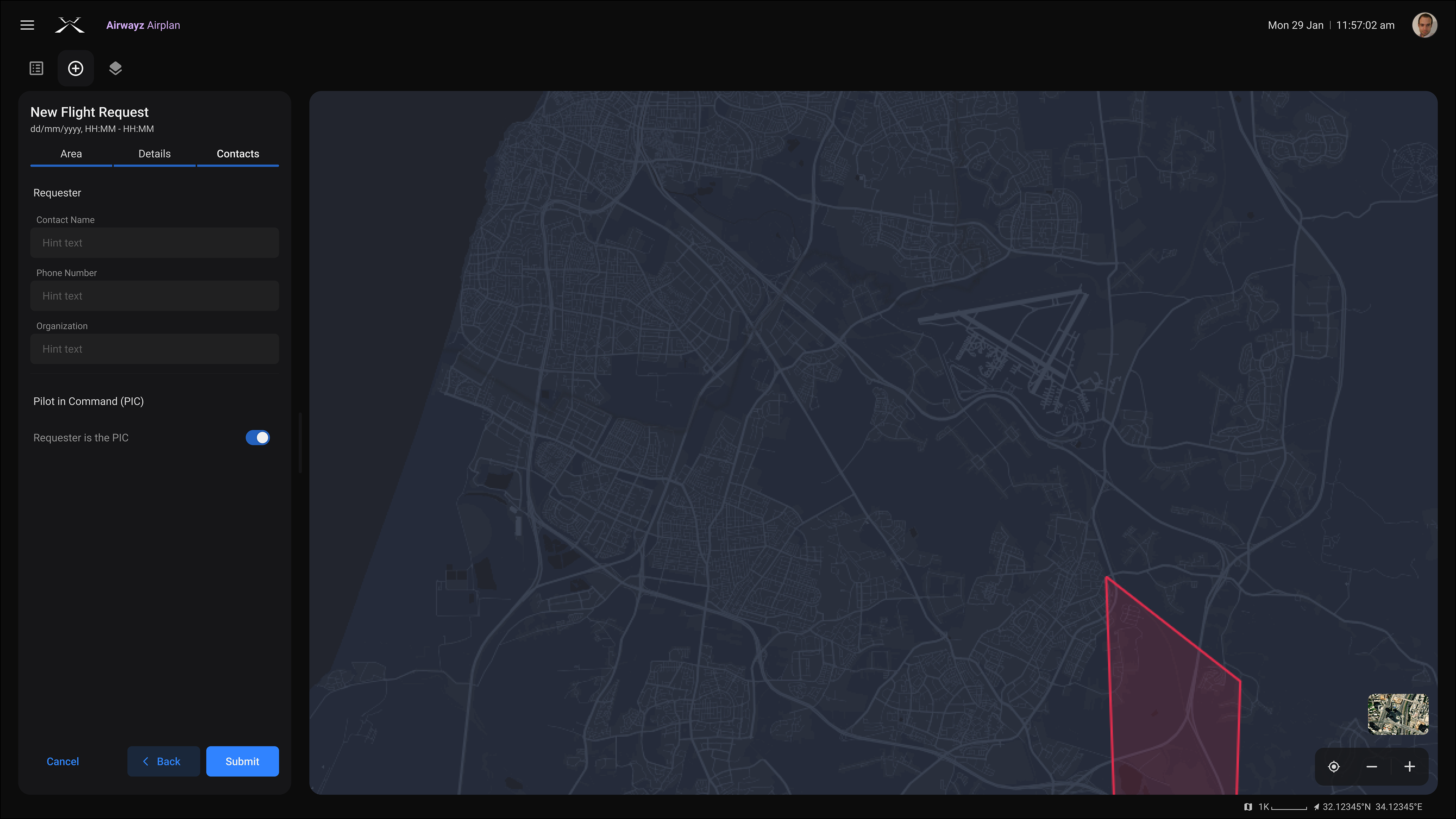
Flight Request step 3
Flight Overview
Airplan's main screens, from flight list, through flight request (3 steps) and the overview screen
________
Micro-interactions triggered team debates on clarity vs. speed.
Internal usability testing helped us validate the preferred flow early on.
Internal usability testing helped us validate the preferred flow early on.
________
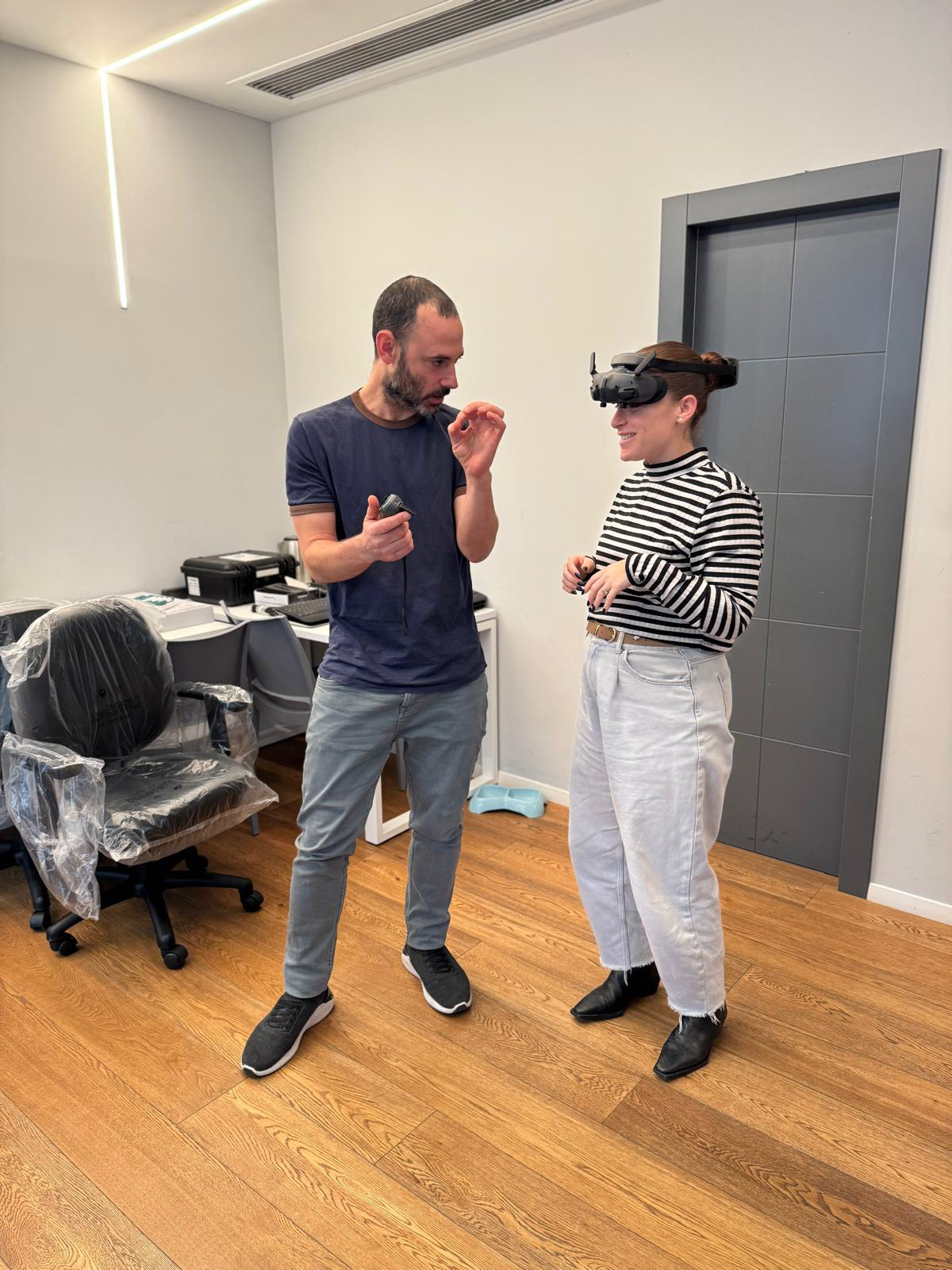
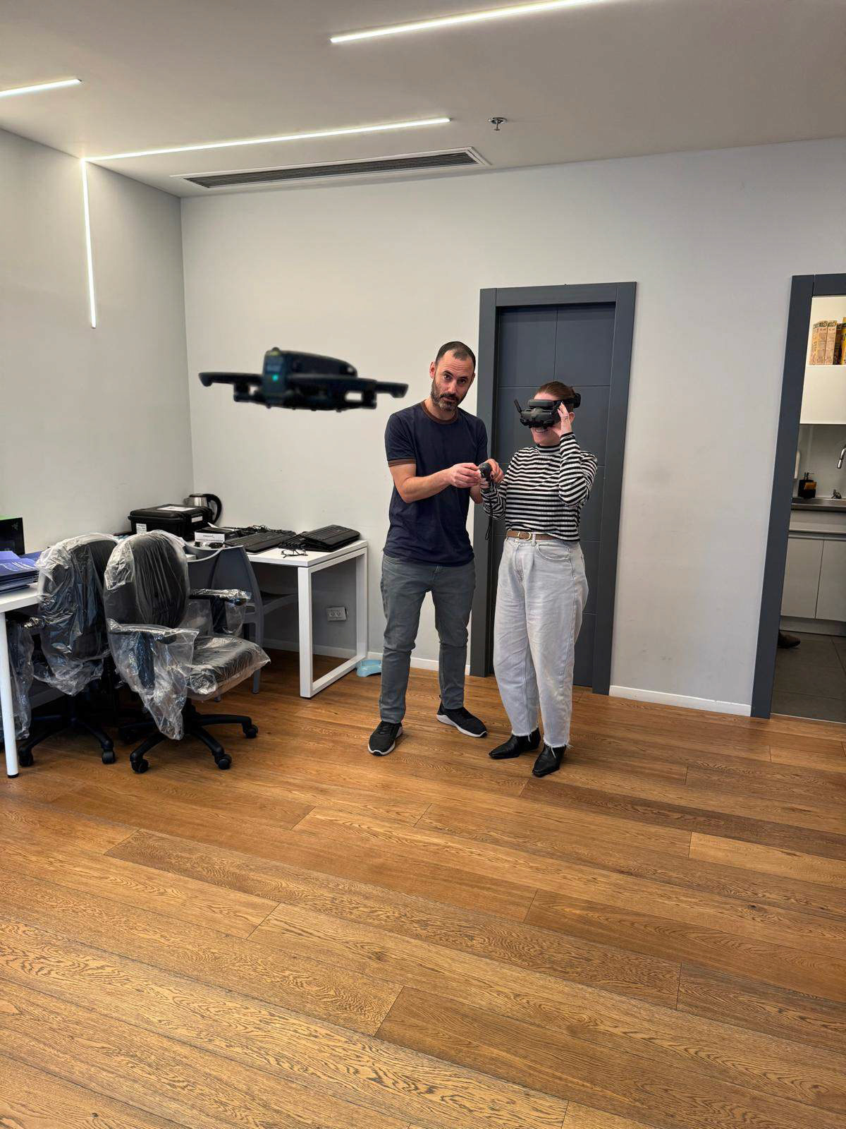
Becoming a drone operator for a day… purely for research, of course.
PHASE 2
Deep User Insights
Once the first version was delivered to development, I shifted focus to a deeper research.
We wanted to define the next-generation features for both current and future users.
We wanted to define the next-generation features for both current and future users.
What I did
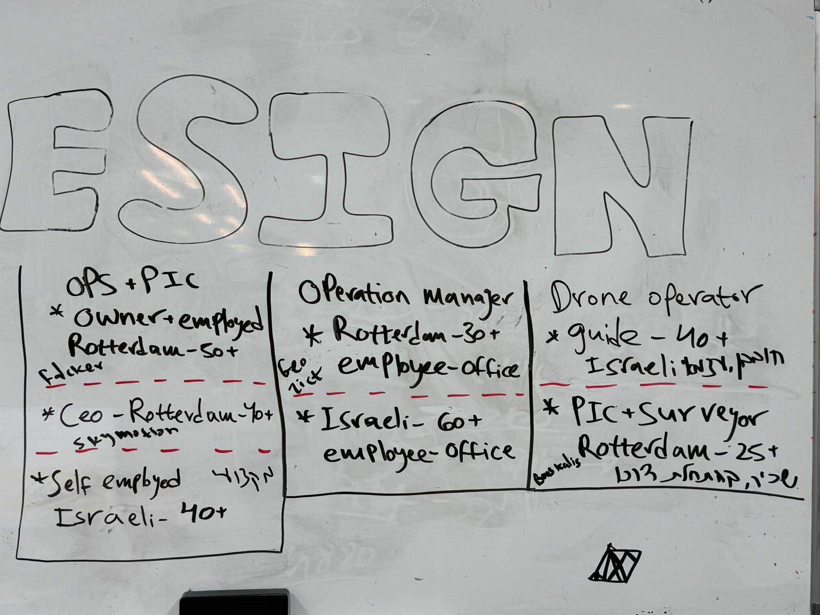
- Mapping personas and user gaps
- Creating detailed user journeys
- Prioritizing needs vs. feasibility
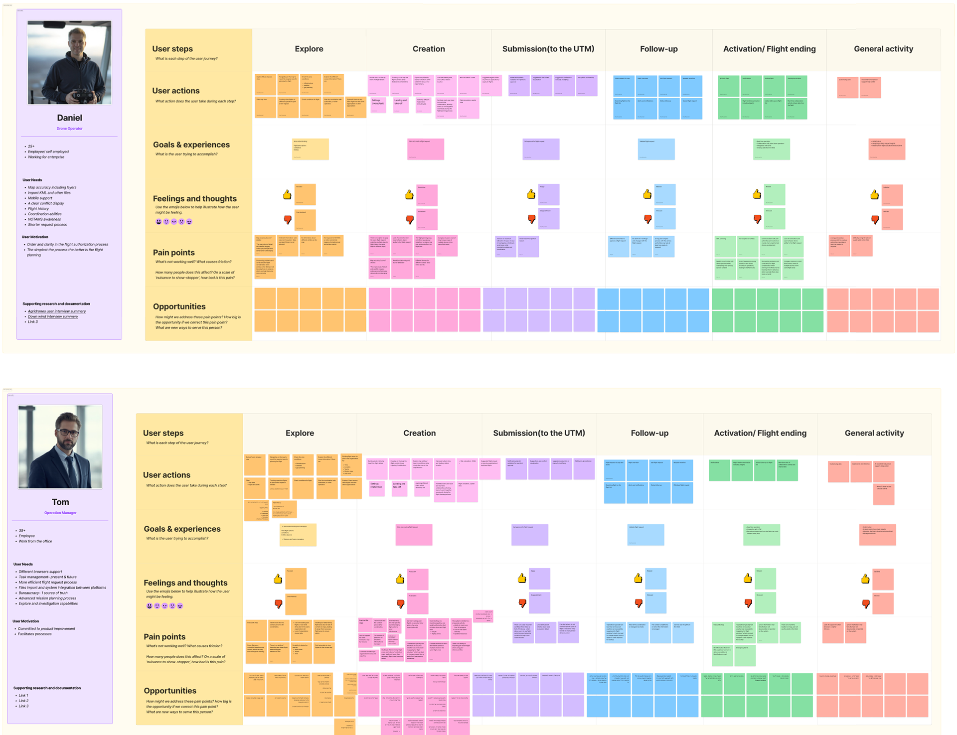
Started with five personas — ended up with two journeys that truly mattered.
Mobile version
The Airplan interface was designed responsively, but many features were limited on mobile. The research highlighted a clear need for mobile access, as more than half of our users are field drone operators. During mobile design, I uncovered usability challenges, especially when interacting with the map and viewing key data. As a result, mobile was restricted to data viewing only, rather than full flight plan creation.
PHASE 3
Expanding Capabilities
With a stable foundation in place, we began designing features that delivered real value:
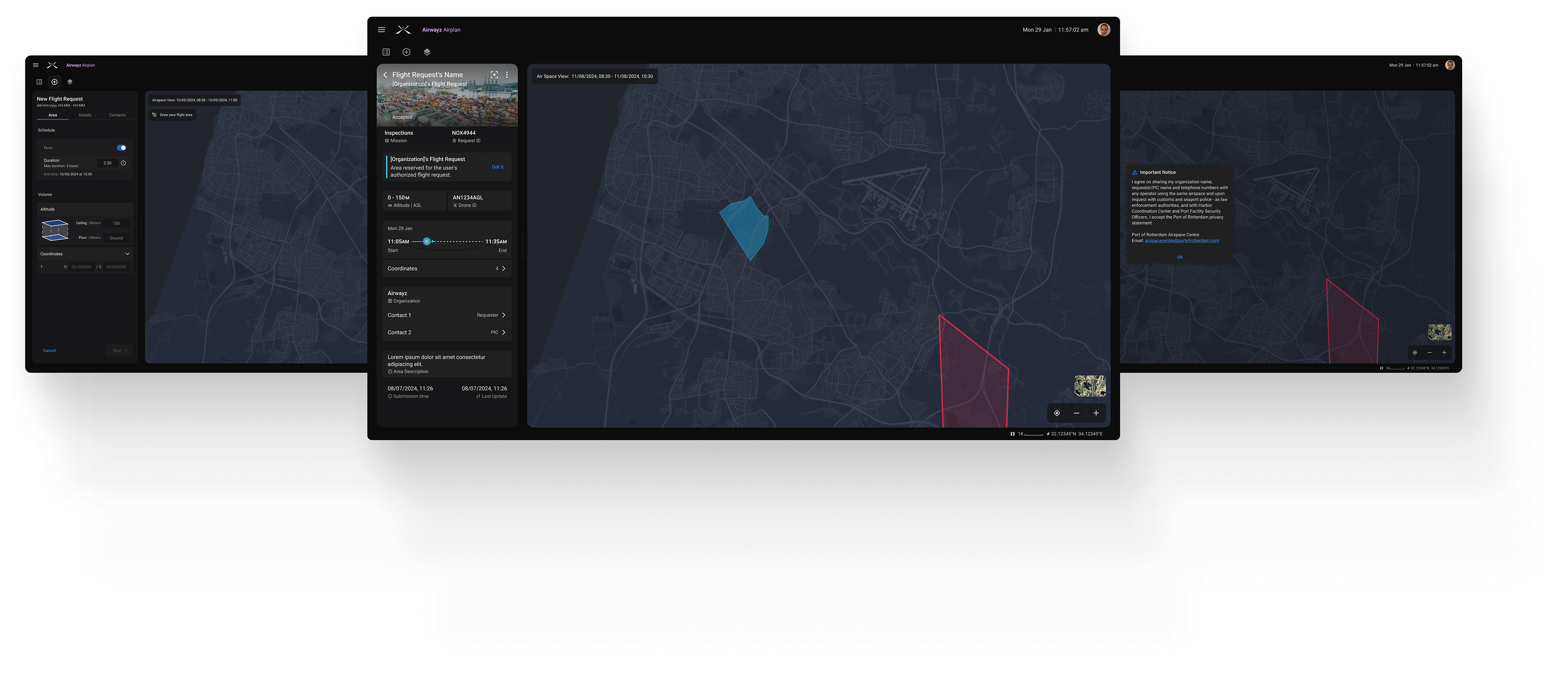
Geo-awareness tools
Giving users clear visibility into flight zones and allowing them to explore the area before submitting a request, helping reduce unnecessary rejections.
Duplicate & Edit functions
Saving users time and improving flexibility when planning flights.
Drone database
Reducing the time it takes to submit a request by eliminating the need to re-enter aircraft information.
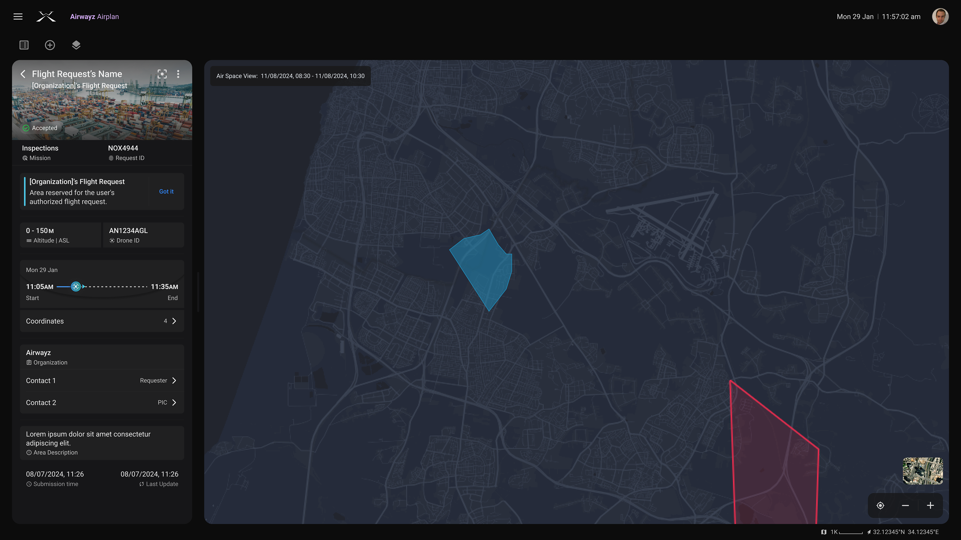
Geo - Awareness
When flying a drone, there are different types of zones, each of them with different information.
One of the main challenges was ensuring users received this information at the right moments—before starting a request, while defining their flight area, and right before submitting it. This feature was required for regulatory compliance, but it also helped addressing a key pain point: coordinating between multiple parties and improving users’ understanding of the flight zones.
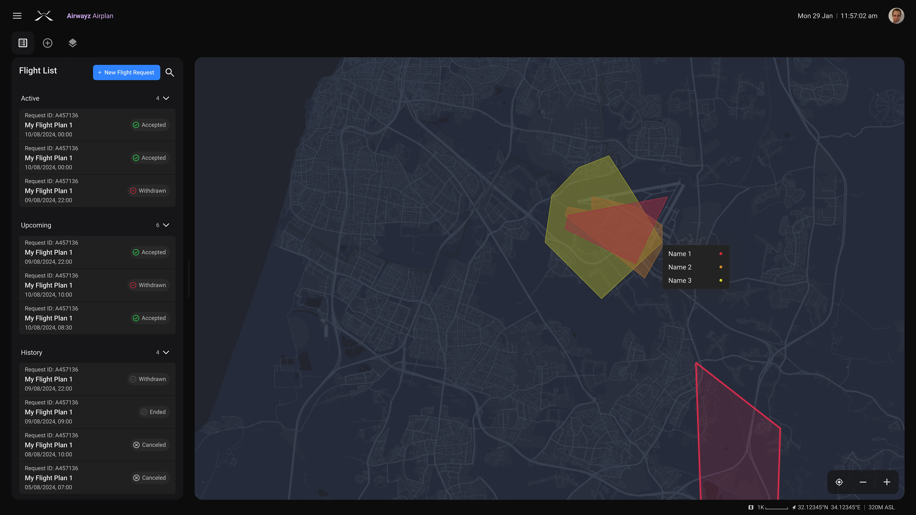
When multiple zones are layered
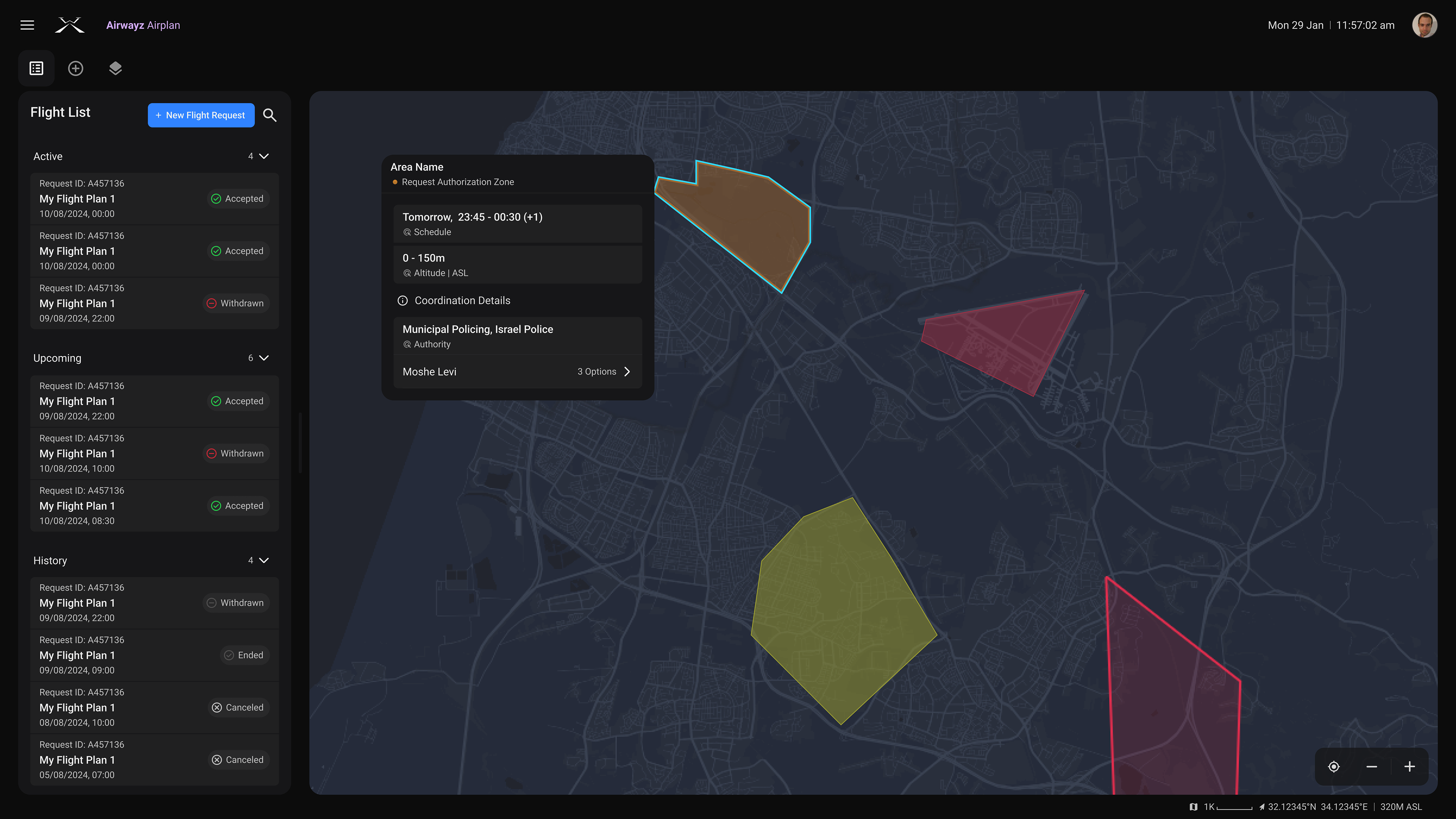
When selecting Request Authorization zone
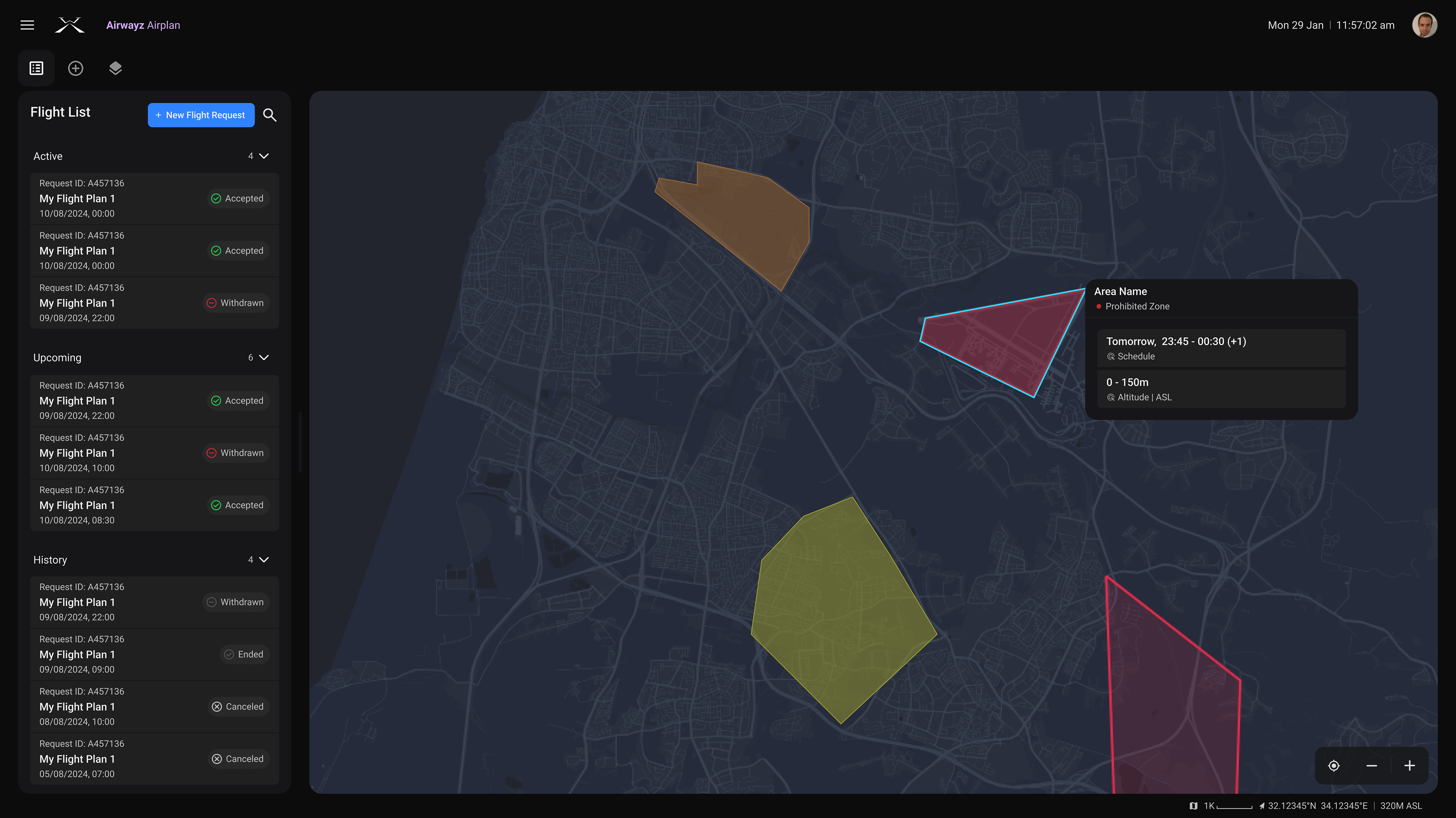
When selecting a Prohibited Zone
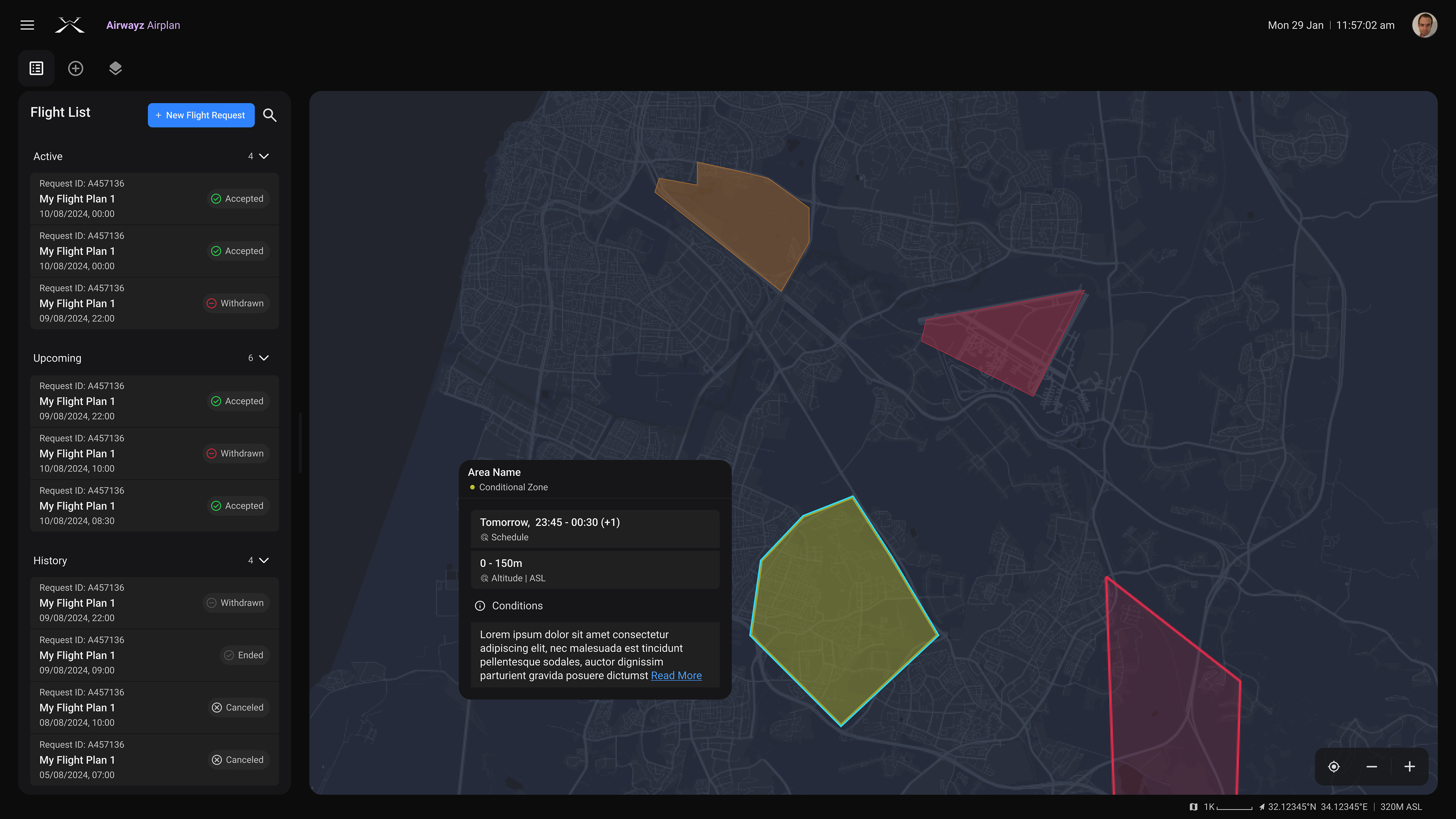
When selecting Conditional zone
The 'Exploring' part, before submitting a request, the user can view zone information by clicking on it.
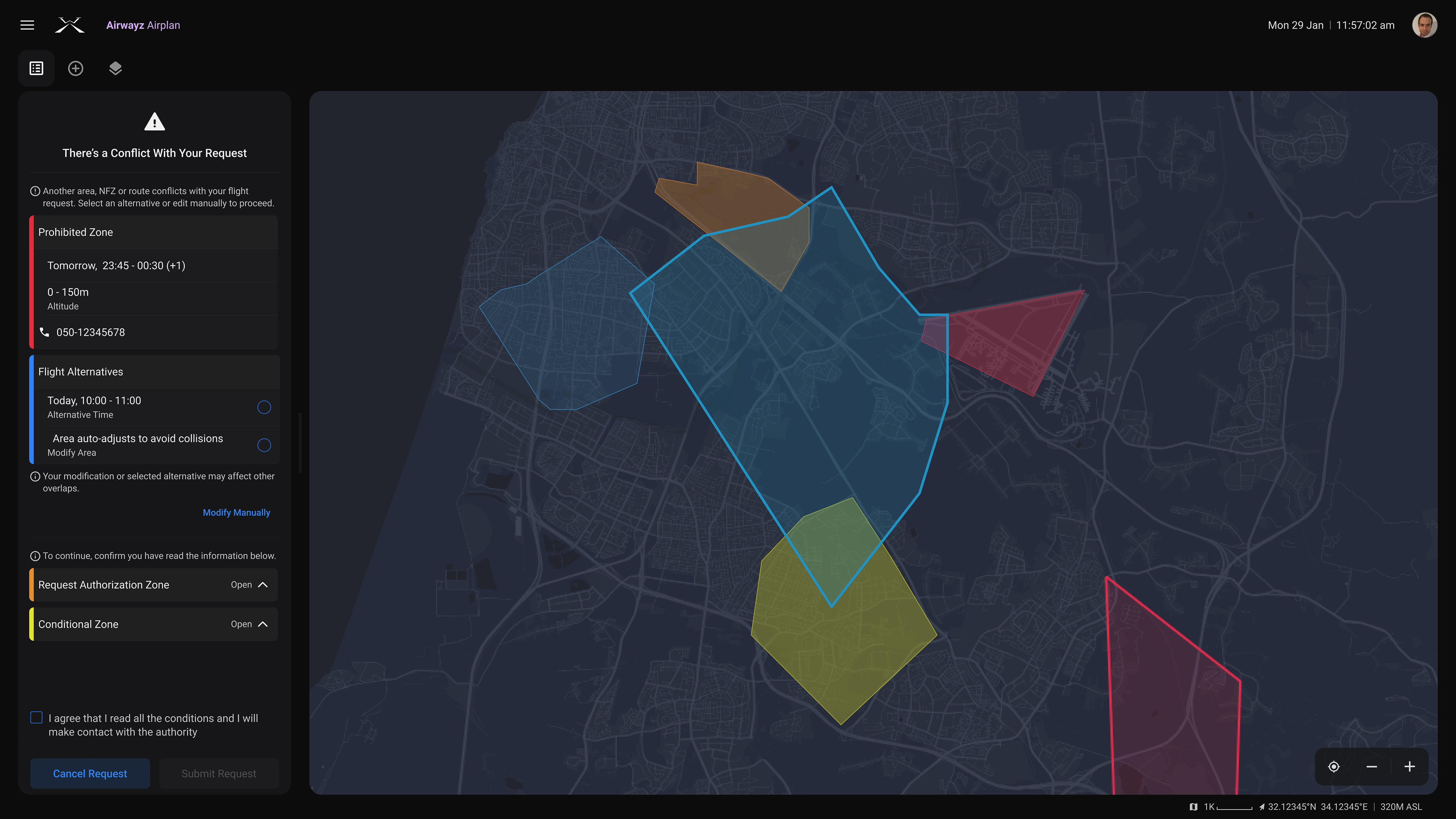
Option No.1 flight alternatives combined with issues
Option No. 2 — flight alternatives and issues are separated.
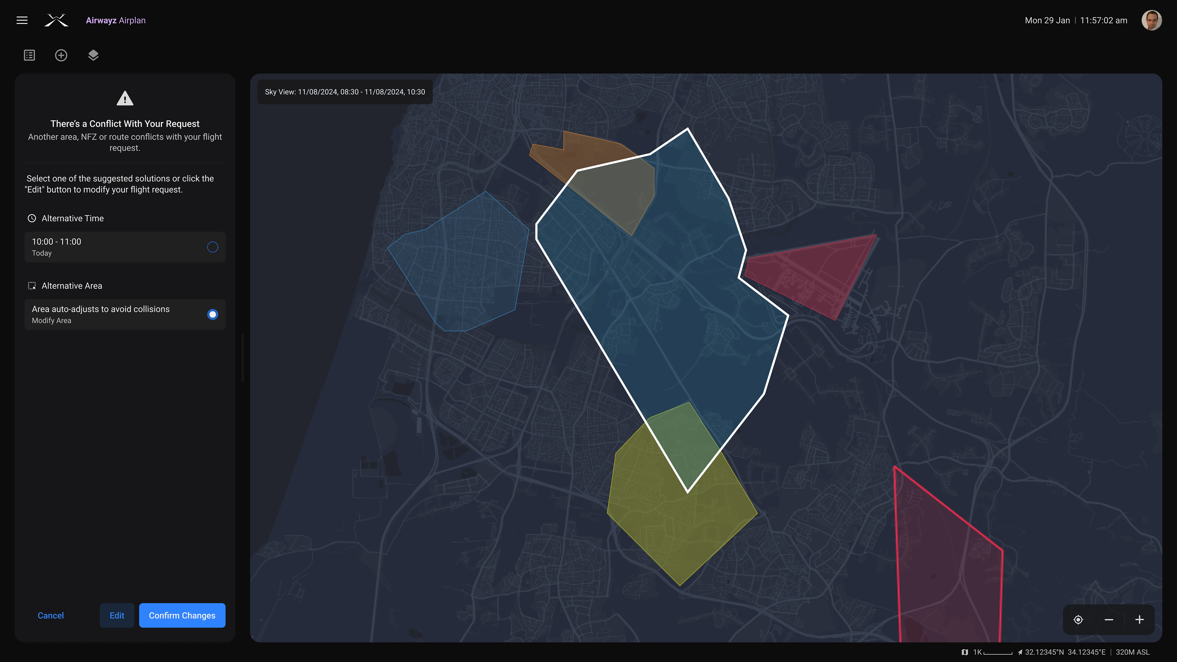
Option No. 2 — flight alternatives and issues are separated.
For options No. 1 and No. 2, the issues are shown within the flight submission flow.
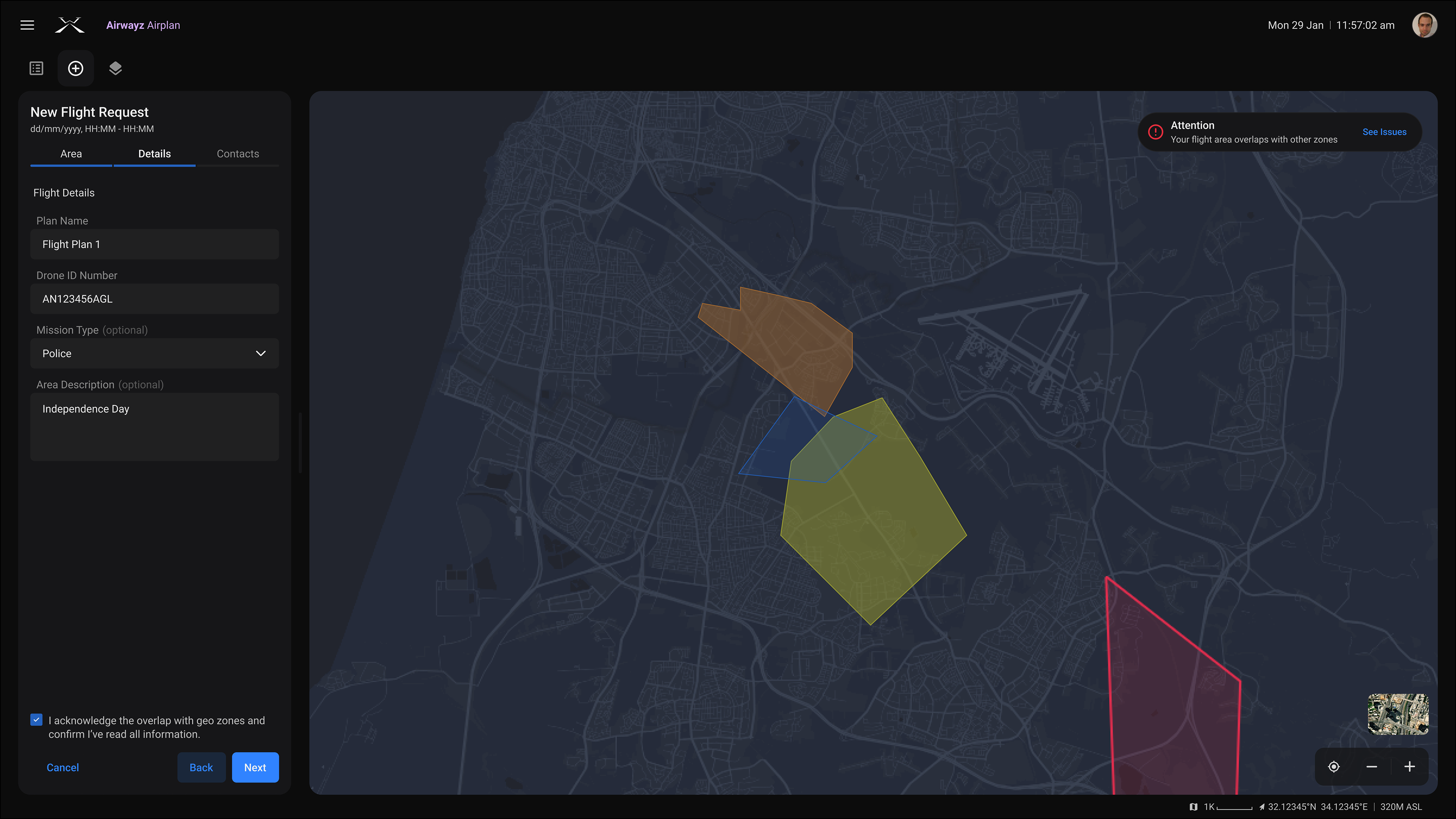
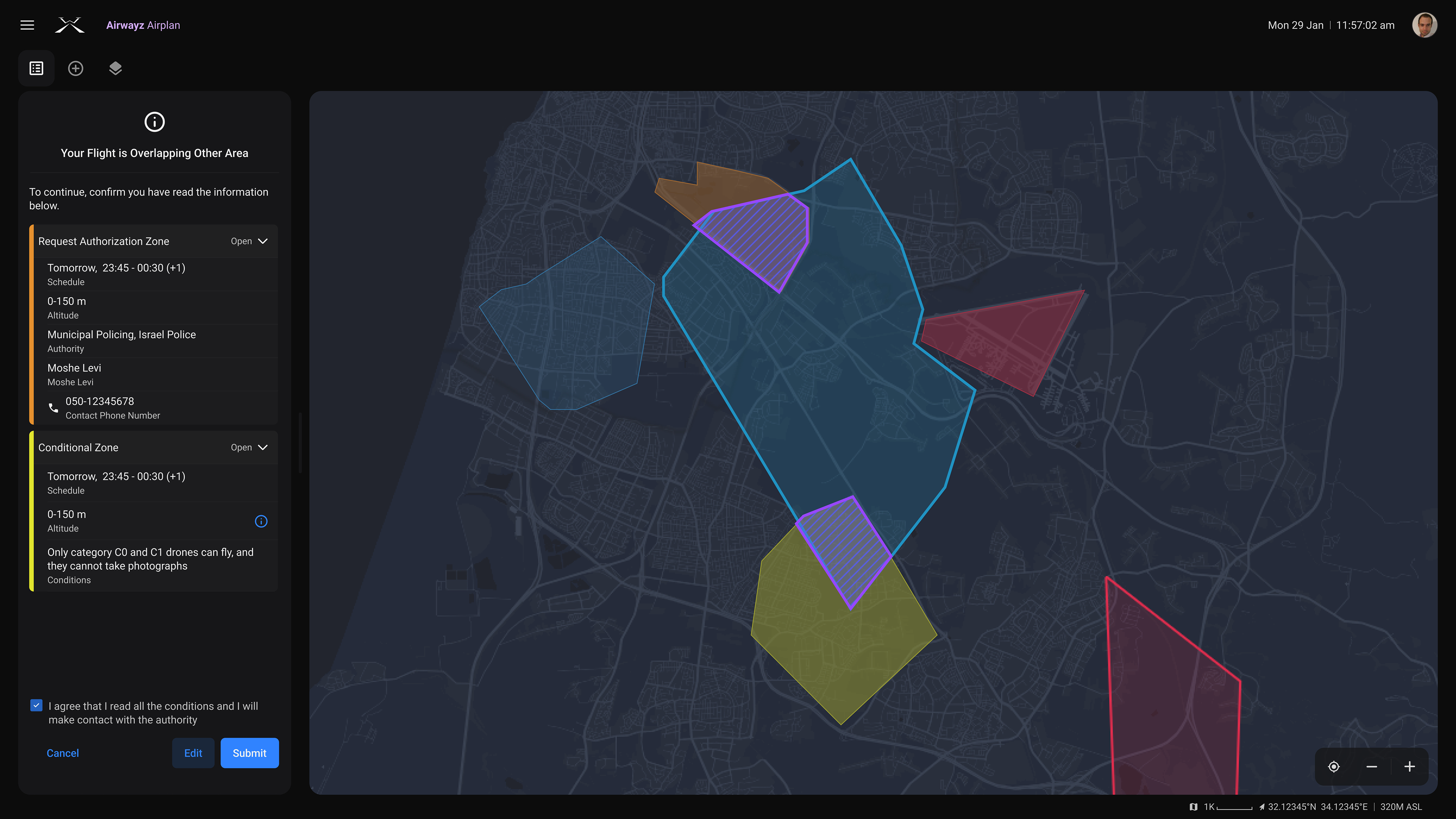
User is notified that they are overlapping with other areas.
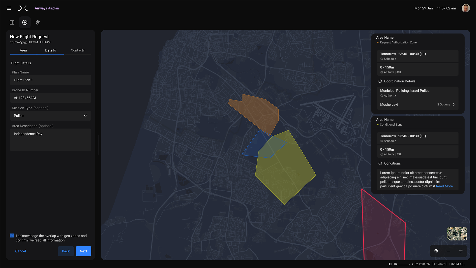
After user selects "See Issues"
In Option No. 3, the issues are presented as notifications — this was the chosen approach.
________
This stage represented a shift from redesign to product growth and innovation.
________
KEY INSIGHT
Challenging Assumption
This project reminded me that:
- Small design decisions have a big impact when validated early.
- Consistency drives both usability and team efficiency.
- Research never ends — it evolves with the product.
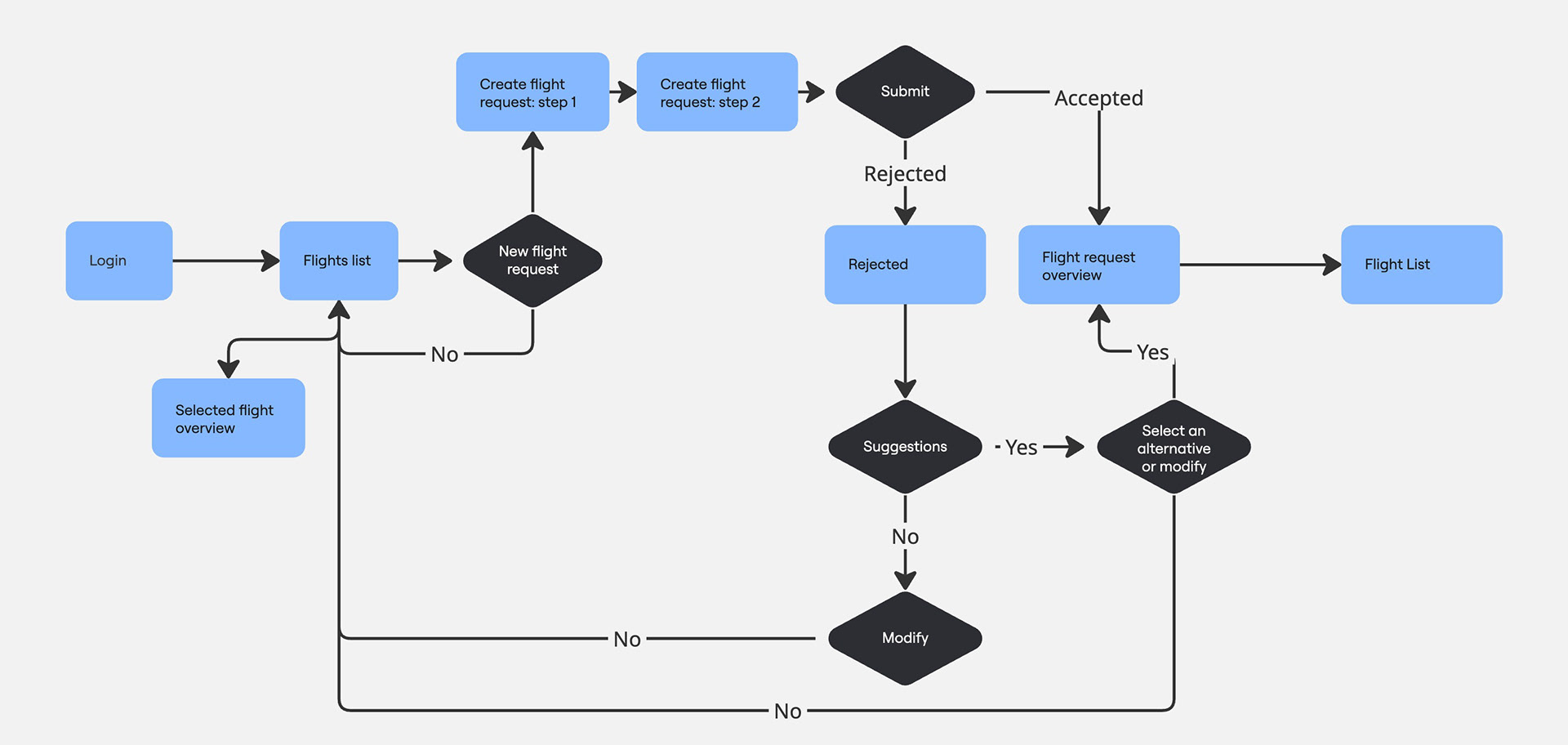
Airplan — full flow of submitting a flight request, from login to successful confirmation.
________
What began as a technical redesign turned into a journey of rethinking how users interact with our system — and how our team designs together.
________
OUTCOME
What's Next?
The Geo-awareness feature revealed a new need for admin control over flight requests.
Development paused to refine this direction, ensuring future versions balance automation with manual oversight.
Development paused to refine this direction, ensuring future versions balance automation with manual oversight.
The redesign still marked a big step forward, laying the foundation for smarter, more flexible management tools.